Examining the 2013 Lexus ES Interior


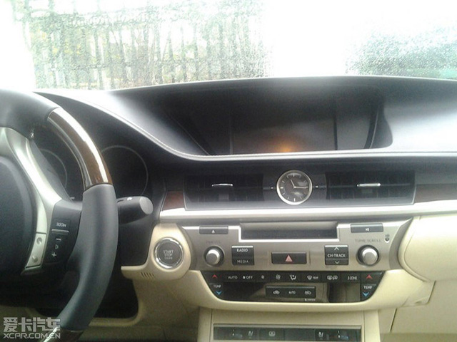
One day after the new 2013 Lexus ES was revealed, let’s return to the photos and take a closer look at the interior — first off, here’s the wide-angle shot (click for a larger version):

Clearly, the fourth-generation GS interior has set some guidelines that will be seen throughout the lineup — the analog clock between the center console vents, the wide horizontal instrument panel, the new Remote Touch controller, the sloping dashboard with the inset display, these are all design cues shared between the new ES and the released GS.

One other thing that ES & GS share is hidden behind the shifter — it looks like the new ES will have the Drive Mode Select (highlighted here with a red arrow):
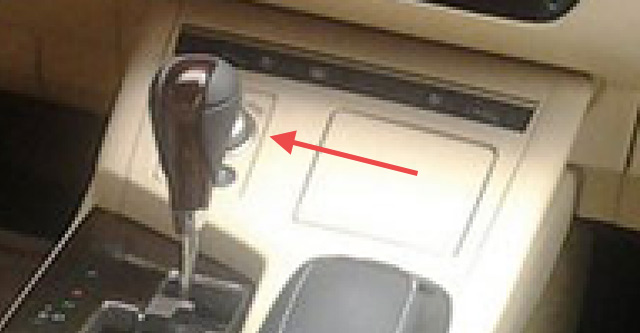
Lexus ES 350 Drive Mode Select

The other leaked photo of the 2013 ES is a closeup of the instrument panel (click for a larger version):

2013 Lexus ES Interior Closeup

The LCD screen looks to be the 8″ standard display rather than the new 12.3″ optional display seen in the GS, though the space does appear to be large enough to accommodate the larger screen. Beyond that, there’s an interesting visual line running through the vents and wood trim that gives the dash a wedge shape — nice detail work there.

What do you think? Did I miss anything?

InteriorsLexus ES: Fifth GenerationSpy Shots
Comments
K
  • K
    Khedr 24
  • February 22, 2012
i think that this car should be revealed at the current running geneva show
    K
    • K
    • February 22, 2012
    Unlikely considering the ES isn't currently available in Europe -- more likely the NYC or Beijing shows in April.
    M
    • M
      Mike DeLorca
    • February 22, 2012
    Krew----did I see from previous post that the ES 250 was tradmarked for certain markets, but not NA. If that is so, maybe we are looking at a much toned down version from what NA will see. Maybe the interior will be a bit more upscale than this and this is only the foundation to start with the 250 entry level. I am a fan of the exterior especially with it's stretched look that resembles the LS....can only hoep the new Generation LS will be totally outstanding.
A
..
Y
This would definitely on Beijing Auto Show because Lexus ES would be a good car for Chinese Market ... and since this is a ES250 , I won't be surprise if there's larger LCD available on higher class like ES300h or ES350 !
T
  • T
    Thegreatkingissafe
  • February 22, 2012
The clock doesn't look the same as the GS. They should standardize it to one look for branding...
S
  • S
    Stan
  • February 22, 2012
The radio and climate control area looks like a smiley face. I can already see that area being changed after the first facelift comes out. And also the gear knob is old style, not like on the new GS.
M
The center console (shifter) looks to be of cheap hard plastics.....
    T
    • T
      Travis
    • February 24, 2012
    Too bad your wrong because the current ES shifter feels good in the hands I would think this is the same or better
    E
    • E
      enthusiast
    • February 25, 2012
    I agree, as I mentioned in another thread; the center console looks more Camry-like than Lexus-like.
J
  • J
    Josh Mathews
  • February 22, 2012
also note the new design of the steering wheel like on the GS
    K
    • K
    • February 22, 2012
    Actually meant to mention the steering wheel but it slipped my mind -- good call.
R
  • R
    Robert
  • February 22, 2012
The center console below the vents doesn't have the clean simple sophistication as the GS.  I agree one is reminded of a smiley face . . . or a Cyclops.  Busy with puffy cheeks and one eye!
T
Sweet
W
  • W
    Walterdwilliams
  • February 22, 2012
The spindle effect is seen around the metallic housing of the audio controls.
    A
    • A
      AndyL
    • February 22, 2012
    Good observation. That's the consistency between the exterior and interior design elements that are also found in a lot of Lexus vehicles which are their strength IMHO...
A
  • A
    AndyL
  • February 22, 2012
To add more detail... there seems to be 3-zone climate control --- the button next to the passenger's side temperature controls.
H
  • H
    Hillyb
  • February 22, 2012
The interior is pretty good..
T
  • T
    Travis
  • February 24, 2012
If the ES and GS interior looks this good.... just imagine the LS !
L
  • L
    Lou
  • February 24, 2012
The drive mode is like the one in the CT and this may be a Non Nav car ....the remote touch is missing the Menu and Map Voice buttons and the control button... which may be the reason the screen is smaller...it apears there's enough room for thr larger GS screen
R
The interior is a fail IMO, there is no coherent flow with the dashboard and really looks ugly. The GS on the other is rocking, just gorgeous.
S
  • S
    sc430
  • February 28, 2012
I work for lexus and this isn't the NA model ES
    R
    • R
      RAL
    • March 3, 2012
    good!
    T
    • T
      tallguy
    • March 14, 2012
    so how is the NA model ES will look like?
  • Anonymous
  • March 2, 2012
consistency is good but the plastic spacer on the display is too apparent.  Hopefulky, the GS won't look too vanilla in 3 years.
T
that audio part of the center console is driving me nuts.... i ALWAYS WONDER WHY japanese dont do the aluminum parts the way germans do it? it's never shiny, it's never cold when touched... it feels like plastic!!! but it is aluminum according to them.... OH, and the steering wheel is like that too....
L
  • L
    LexusLVR
  • March 6, 2012
I must be in the minority here but this cabin design is ugly and incoherent. As someone here already mentioned, there is "no flow". It's a big mess of shapes and pieces put together. There is no elegance to this design at all in my opinion.
B
  • B
    Bertrandlaurette
  • March 16, 2012
I would lilke to know the date the new 2013 ES will be seen on Internet for Canadian Market and when we will be able to place an order at our local dealer in the Prfovince of Québec, Canada. Also, what colors will be available for the interior leather.

B