JJohn341

Fan
Messages
45
Reactions
74
Another cool, random detail. Look how the doorhandle is incorporated into the arm rest:
Screen-Shot-2021-02-24-at-8.08.28-AM.png

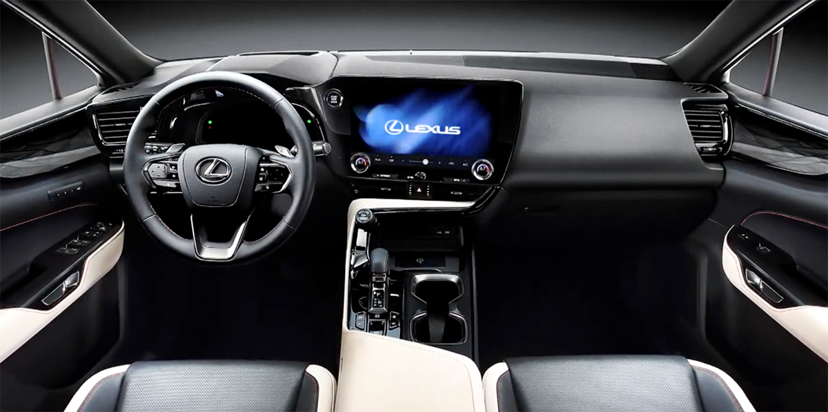
also looks like volume /temp knobs are attached to the screen like the mach-E
 

meth.ix

Admirer
Messages
925
Reactions
1,097
I hope those faux exhaust tips are only going to be on the NX 200 and hybrid models since the small ICEs usually only have one outlet.

Is the car in these images not the F Sport? No tall chin and dark grey wheels, I assumed it is. Unless the non-F Sport NX got rid of the chin.
F-Sport models typically would have a mesh grille, and there's no F-Sport badges visible inside or outside.
 
Last edited:
Messages
18
Reactions
26
also looks like volume /temp knobs are attached to the screen like the mach-E
What I'm most excited for is the digital gauge. Finally the LFA style pods can retire. We need the best displays. I truly believe Lexus can take a page out of Audi and Cadillac.

Audi has Google Maps preview and Cadillac the AR navigation. Lexus can do all this while ensuring reliability that those brands can't do or care for. My money is betting the LX600 has cameras that rival the best of any European brand.
 
Messages
18
Reactions
26
Out of the 2nd NX I am thinking of this 2NX interior if it will be appear in the RX or TX and how they can make it more premium as related to the mid size lux SUV
Think bigger screens, lighting and the like.

The TX is gonna be the 3 row right? It's gonna compete finally with the X5 or X7 so big and comfy is where it's at. Should be an LS SUV.
 

mediumhot

Follower
Messages
492
Reactions
636
It just looks premium. And doesn’t have 800 buttons either. With the loss of the trackpad the design can be totally different. I can’t figure out if the Murai has one

View attachment 4657View attachment 4658

Those flat surfaces on passenger side are so Lexus/Toyota mid 2000s. Very weird and weak detail to make throwback theme out of it. I applaud them for trying to integrate that tablet somehow into the trim instead of having it stick out like an attachment like MB does which looks super gimmicky and will not age well at all. Door arm rest is straight out of Toyota stuff but considering this being NX it's kind of expected. Seat design as well. Placement of buttons is all weird, they did the same mistake Acura did with driver mode button, in Acura they confuse it with audio knob in NX they will confuse it with Push to start which itself is randomly thrown into the place of now defunct analogue clock. But dead give away someone did not think this through is volume knob placed on the dash, zero reason to be there for either the driver or passenger. Again such a shame they did not build up on UX concept of audio control, in UX they were somewhat flawed but it could have worked if more thought was placed in it.

As Toyota interior I would give it 5 out of 5 but as Lexus interior much like previous gen NX I'm not sold at all. It's like continuation of CT and current NX interior of Toyota bits mix and match philosophy which UX has somehow managed to conceal very properly but this one did not. I don't doubt in new generation of driver's technologies that will debut in this car, I don't doubt in new infotainment (at least they put all the tappable menu pixels on drivers side this time around instead all the way to the right of the screen like they have in LS refresh) and I think touchpad lives on in form of that cheap capacitive plastic transparent bits on steering wheel, at least I hope so. But no worries everyone now does that smudgefest including Ferrari. My other hope is that they upped fit and finish compared to current NX and even more importantly is to make it smell like Lexus inside the cabin instead of having it smell like Toyota.
 

spwolf

Expert
Messages
3,536
Reactions
3,452
that empty area in front of the passenger does look like weak spot, it probably does have nice quality so it might not look bad in real life.

Otherwise, toyota interiors do not look anything like this at all.
 
Last edited:

supra93

Expert
Messages
1,126
Reactions
1,967
It looks like a lot of the vids have been taken down from both YT and streamable. I just think it's funny that the PR department is still trying to "fix" this. Kind of like trying to stop the Titanic from sinking after it already hit the iceberg.
 

supra93

Expert
Messages
1,126
Reactions
1,967
I was under the impression that the NX will be the same size as the Venza.


Sulu

Expert
Messages
1,078
Reactions
1,331
And now even Lexus is doing the E-shifter and touchscreen AC nonsense...
This is not the first Lexus' e-shifter is it? Don't the current LS and LC have an e-shifter? But this new NX e-shifter, at least, looks like it has the standard, linear, fore-and-aft PRND shift pattern and without a separate button for "P". If this is the case, I won't mind it; I do not like the separate "P" button.

I agree about the "touchscreen AC nonsense"; I prefer dials (at least for temperature setting).
 

meth.ix

Admirer
Messages
925
Reactions
1,097
I agree about the "touchscreen AC nonsense"; I prefer dials (at least for temperature setting).
The dials for temperature do appear to be physical:
4660
I would guess it works in a similar fashion to the Ford Mustang Mach-E, where it appears that they put a cutout in the screen to add the volume knob, but in reality the dial is attached on top of the screen, with the underside designed to simulate a finger drawing a circle on the screen.
4661
 

Levi

Expert
Messages
2,843
Reactions
3,271
can't wait to see more pics. LC, IS gen 3.1, NX gen 2. every new Lexus has better looking design. this just looks sooo good (design).
 

spwolf

Expert
Messages
3,536
Reactions
3,452
yes, the temperature dial is physical, and to me shifter looks a lot better than before. It is not quirky like in Prius or Mirai, just nicely designed shifter. Small and nicely integrated as supposed to that fake shifter before. why have huge shifter that pretends to be manually linked to the transmission?
 

mordecai

Follower
Messages
150
Reactions
409
I absolutely love the exterior design, another home run by Lexus after the stunning IS refresh. Lexus has to keep this going, their exterior design team is on fire. 🔥🔥🔥

The only blemish is the somewhat dull interior design, it doesn’t really scream luxury. I absolutely loathe Genesis for their lack of innovation and business model, but I would say their recent interiors are much better than this new NX, even the GV70. As gaudy/tasteless as that interior is, you couldn’t say it looks like a Hyundai interior. I couldn’t say the same about this NX interior, especially with the Mirai out there as a Toyota.