internalaudit

Expert
Messages
1,150
Reactions
1,138
Really nice exterior design!


Maybe cost-cutting measure?

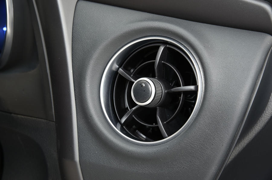
toyota-auris-touring-air-vents.jpg


It looks based on the Auris facelift air vent, maybe just with a new wheel?

Just like in our RAV4, horizontal central vents and circular side vents. Now I feel like driving a 3.3IS.
 

spwolf

Expert
Messages
3,536
Reactions
3,452
Interior is very strange and disappointing... circular vents on the outside of the dash mixed with rectangular vents on the inside is a downgrade from the current car. The vents look awful. Bigger touch screen is a nice addition but the steering wheel, dash and center console need a lot of work.

i think disappointing part is that it is the same. Everyone expected reversed situation - little changes on the outside, and big in the inside.

IS interior quality was pretty good in luxury edition i drove, but this will look exactly the same and steering wheel is also exactly the same.... eh.
 

carguy420

Admirer
Messages
836
Reactions
1,097
Personally I'm more interested in its handling and the way it drives, since Lexus touts it as some cornering machine(at least for a sedan) in that ad. It better drive as good as it looks.

Why Lexus didn't give it a brand new interior after going through such great lengths to give it such an amazing exterior? Ran out of budget? At least throw in their new steering wheel.
 

OlFius

Founding Member
Messages
175
Reactions
194
Probably the most beautiful version of the IS.
Probably, because we first have to see it in real life, but that may take a while, I live in Europe .... 😢
 

momers

Fan
Messages
25
Reactions
54
I think the interior of the existing 2017 or the original 2014 is pretty good, very different from anything else and very sophisticated on it's own. I may be biased since I own one, but I always find other layouts in similar cars a bit weird in that they feel wrong! So why change a very decent interior in a late-mid cycle refresh? Also a brand new interior layout is best saved for the next gen version, if and when there is one.
 
Last edited:

Rydo

Follower
Messages
280
Reactions
485
Finally getting a chance to dump in my pointless 2 pence on this vehicle.

The exterior is okay - nothing breath-taking. The interior is the same with a touch screen. Still has the same embarrassingly old-gen layout which is painfully obvious when you open the door to an LC, LS or UX to see the new design language.

The rear light-bar thinking is becoming pretty sad - is that just going to end up on every single vehicle? I positively hate the Germans for such unimaginative styling choices. I get brand identity but I also love a bit of variation among vehicles too. If rumours about the LC being ruined with this full-width light are true, then it's a sad day.

Whatever happened to the beautiful LF-FC rear-light layout?
 

spwolf

Expert
Messages
3,536
Reactions
3,452
Finally getting a chance to dump in my pointless 2 pence on this vehicle.

The exterior is okay - nothing breath-taking. The interior is the same with a touch screen. Still has the same embarrassingly old-gen layout which is painfully obvious when you open the door to an LC, LS or UX to see the new design language.

The rear light-bar thinking is becoming pretty sad - is that just going to end up on every single vehicle? I positively hate the Germans for such unimaginative styling choices. I get brand identity but I also love a bit of variation among vehicles too. If rumours about the LC being ruined with this full-width light are true, then it's a sad day.

Whatever happened to the beautiful LF-FC rear-light layout?

do you really think this looks similar to the UX with rear light-bar? Looks pretty different IMHO.
 

Gecko

Administrator
Messages
4,910
Reactions
11,843
If we'd gotten UX steering wheel instead of UX vents, that would have been very nice. The most tactical piece of the interior has been the exact same since 2013... changing that would have at least created some immediate "upgrade" for prospective shoppers.
 

spwolf

Expert
Messages
3,536
Reactions
3,452
If we'd gotten UX steering wheel instead of UX vents, that would have been very nice. The most tactical piece of the interior has been the exact same since 2013... changing that would have at least created some immediate "upgrade" for prospective shoppers.

ux steering wheel is also too big though. Just needed to upgrade the current wheel with different buttons :)
 

CRSKTN

Expert
Messages
2,060
Reactions
3,403
Interior is fine. The IS has a very unique cockpit.

We really need to get hands on with the interior. From what i'm seeing, i have a feeling a lot of the changes were in fit/finish/details.

For anyone who hasn't experienced the same interior with better fit/finish/materials/seating position in the RC F, you'd be surprised what a difference it can make.
 
Messages
40
Reactions
162
Turned out these illustrations by Best Car were almost 100% accurate.
The more shocking fact? These were on the article almost 2 years ago.😱 They must have secret access to informers.....
https://www.google.co.jp/amp/s/bestcarweb.jp/newcar/47515/amp
CDFB0CE4-8195-422B-B96E-02DD8530D060.jpegA1E188D6-EABA-432C-9DAB-E3381E4C3FE2.jpeg
Btw I’ve been pretty inactive on here for quite a while on here, just like the Lexus lineup. It’s always good to see new models coming out, even if it’s “new”. I’m a fan of the look of the “new” IS.
And good to be back here!
 

Gecko

Administrator
Messages
4,910
Reactions
11,843
Interior is fine. The IS has a very unique cockpit.

We really need to get hands on with the interior. From what i'm seeing, i have a feeling a lot of the changes were in fit/finish/details.

For anyone who hasn't experienced the same interior with better fit/finish/materials/seating position in the RC F, you'd be surprised what a difference it can make.

If you have been in any of the competition over the last two years, I think "fine" is probably a kinder adjective to use. The design is unique, yes, but it also has that space eating plateau in the middle of the dash and the materials are quite poor. I would venture to say that a Camry XSE or Accord Touring have significantly nicer interiors. The C300 interior is beautiful and feels 2-3 classes above the IS, and the 3er is much nicer as well. I dislike the design of the A4 interior, but the materials are very nice. G70 interior is beautiful. This new IS has faux stitching across the dash, so that will hopefully go a ways towards improving the material of the glossy, 90s Toyota-ish dash material that exists now.

I can't put my finger on what should necessarily change outside of the shape of the IS' dash, but yeah... interior is a weak point for the IS, no way around it. That is why so many of us were expecting more of a change.

Keep in mind that we are talking about a car that's going to cost ~$55-60k for F Sport V6 trim. Hard to justify almost a 2x price increase over a Camry XSE V6 when they have the same engine and the Camry has a nicer interior, IMO. We are looking to move out of our IS 350 into something different, so this has been a point of discussion over the weekend.
 

Joaquin Ruhi

Moderator
Messages
1,529
Reactions
2,434
Turned out these illustrations by Best Car were almost 100% accurate.
The more shocking fact? These were on the article almost 2 years ago.😱 They must have secret access to informers.....
https://www.google.co.jp/amp/s/bestcarweb.jp/newcar/47515/amp
Thank you for locating and reposting those renderings. When I saw the leaked exterior photos my mind immediately ran to those Best Car renderings and how much closer than I would've imagined they were to the actual car. I was going to track them down and post them here later today but you saved me the time and trouble. Thanks!
 

CRSKTN

Expert
Messages
2,060
Reactions
3,403
If you have been in any of the competition over the last two years, I think "fine" is probably a kinder adjective to use. The design is unique, yes, but it also has that space eating plateau in the middle of the dash and the materials are quite poor. I would venture to say that a Camry XSE or Accord Touring have significantly nicer interiors. The C300 interior is beautiful and feels 2-3 classes above the IS, and the 3er is much nicer as well. I dislike the design of the A4 interior, but the materials are very nice. G70 interior is beautiful. This new IS has faux stitching across the dash, so that will hopefully go a ways towards improving the material of the glossy, 90s Toyota-ish dash material that exists now.

I can't put my finger on what should necessarily change outside of the shape of the IS' dash, but yeah... interior is a weak point for the IS, no way around it. That is why so many of us were expecting more of a change.

Keep in mind that we are talking about a car that's going to cost ~$55-60k for F Sport V6 trim. Hard to justify almost a 2x price increase over a Camry XSE V6 when they have the same engine and the Camry has a nicer interior, IMO. We are looking to move out of our IS 350 into something different, so this has been a point of discussion over the weekend.

That's completely fair. I think for me, the fact that the interior of the IS reminds me of the old Japanese radios and electronics i grew up with made it hit a nostalgia point for me, and maybe having not been in the IS for a while now, i've just mentally associated RCF = IS interior.

Personally, i'm not a fan of benz interiors. Just a bit... much, especially with the RGB.

Ultimately, you've made your point and I agree. Competition in the segment is a bit too tight to leave things like this. Still very curious to see it hands on.
 

Gecko

Administrator
Messages
4,910
Reactions
11,843
^I also agree that the interior is a bit of a retro Japanese throwback, and I think that was a large part of it's appeal when the car launched for 2014. Some people didn't like it, some said it wasn't luxurious enough... but for those of us who understood it, we loved it. Me included! What concerns me is that I want the IS to be successful enough to live on, and the case for "Japanese retro" was made 7 years ago while all of the competition has moved on. Losing the GS created some extra runway for the IS (slightly more lux options to fill a "sporty" hole) and I wish they'd have taken that opportunity.

But for now, we can just hope for the best.
 

CRSKTN

Expert
Messages
2,060
Reactions
3,403
They need to move from 80s radio retro, to 90-early 2000's awesome Japanese flip phones and minidisc players retro.

Everything is colored translucent plastic! Also unnecessary but very satisfying mechanical movements for things like changing gears and the glove box.
 
Last edited: