Two weeks ago, I was invited to test drive the all-new 2013 Lexus GS in Dana Point, California. This is the third part of my review -— here’s part one and part two.
So far, my review of the 2013 Lexus GS has covered the mechanical improvements and examined the new exterior styling, so today, let’s look at largest leap forward compared to the previous model — the interior.
Right from the first glance, this is clearly not just a simple massaging of the existing cabin, but a full-scale redesign that brings major changes in design and functionality.
There’s a saying that “simplicity is the ultimate sophistication”, and this certainly applies to the GS’ new interior styling, with its clean, airy feel:
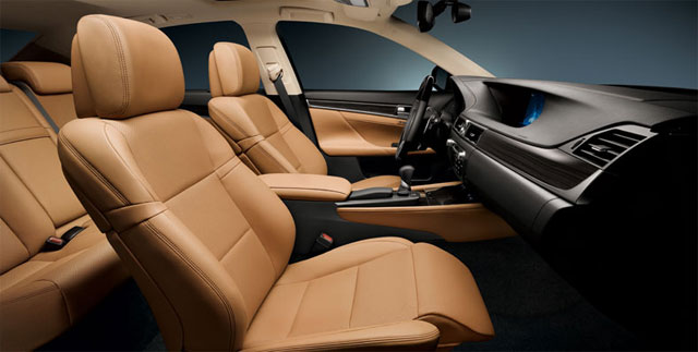
All the materials have upgraded, with large areas on the dash newly covered in leather NuLuxe, to the point that it reminds me of the LS:

As a point of reference, here are the available color combinations:

(Just a reminder, the Cabernet Red is only available with the F Sport model, and Saddle Tan can only be selected for the GS 450h. Update: Saddle Tan is not available in North America.)
Jumping to the new technology in the GS cabin, there’s only one place to start — the giant high resolution 12.3″ Information Display built into the dash:
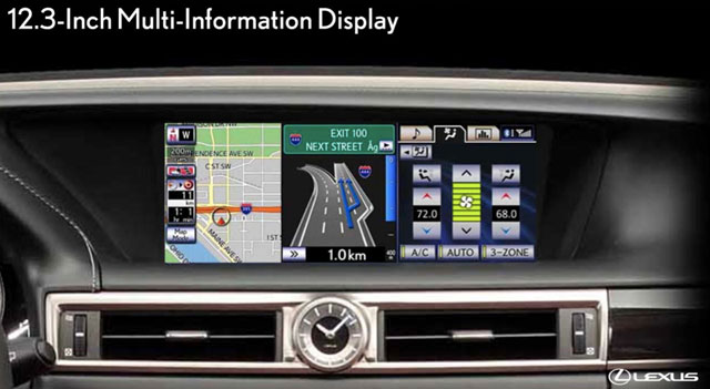
In order to best utilize the horizontal space, the display is divided in half during most operations, with the main task showing up on the left and secondary controls for the audio system, climate control and fuel economy monitoring locked to the right. This is an excellent use of space, and really packs in the available features.
But even more important than the display itself is the new software — along with the usual navigation and audio menus, Lexus has stepped into the “app market” with their Enform 2.0 system:
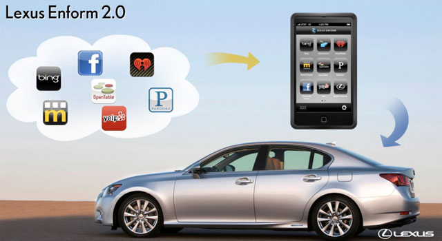
The new GS will be able to connect with seven web services:
- Bing for location searches;
- Facebook for location check-ins;
- Movietickets.com for movie showtimes and ticket purchases;
- OpenTable for dinner reservations;
- Yelp for restaurant recommendations;
- iheartradio and Pandora for Internet radio stations.
In the beginning, functionality will be limited to a subset of the features available from these websites, but here’s where it gets even better — apps can be updated by smartphone, and won’t require visiting the dealership. This allows for a much more flexible experience, including the possibility of more apps in the future.
Another improvement is with the Remote Touch controller — after debuting in the 2010 RX and appearing in both the HS & CT, it will getting an update in the GS, moving from a trackball interface to something more like a standard mouse:
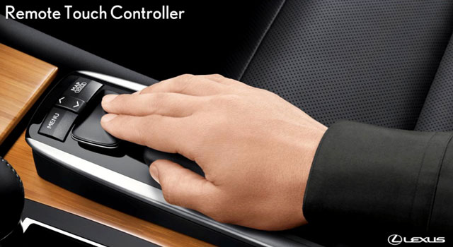
Of special note is the removal of the ENTER buttons — instead, clicking down on the controller is now used to interact with the system.
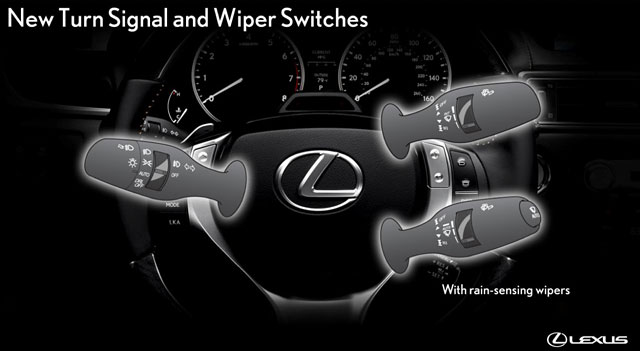
Continuing on, Lexus has also reworked the turn signals, employing the BMW-style function where the stalk doesn’t lock in place, but rather returns to the center:
The new GS also adopts Lexus’ Heads Up Display (HUD) as an option — here are the various panel selections:

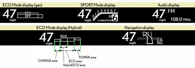
(The HUD is also where the new night vision system will be located, though details on that option were sparse.)
One last thing to mention is the interior LED mood lighting:
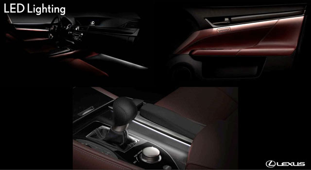
I made sure to sneak out at night and experience this lighting for myself, and details like the LED strip hidden under the door trim gives the interior such an upscale feel — just beautifully done.
With that, I conclude the “just the facts” portion of my GS review — next up, it’s time to get into my driving impressions and share some of the photos I took, starting with the GS 350.
Update: A couple corrections — the dashboard is covered with NuLuxe (a synthetic leather material), not Leather, and the Saddle Tan interior color is not available in North America.

Comments