2013 Lexus GS Revealed!


Just two days before its official unveiling, the 2013 Lexus GS has been spotted without camouflage by Chinese spy photographers — let’s start with the front:

Due to the brightened teaser image we saw last week, there’s not too much in the front we haven’t seen, though we now get a clear look at the foglights and the upper grille’s chrome surround.
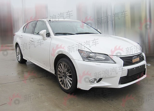
2013 Lexus GS 350 AWD 3/4

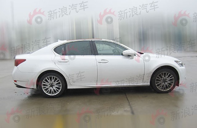
2013 Lexus GS 350 AWD Side Profile

The side profile is almost identical to the LF-Gh concept, with only the door handles & side mirrors showing any difference at all. More than anything, I see the profile as a minor muscular evolution of the current LS — too bad the Starfire Pearl paint hides much of the design lines.

This is also our first look at the base-trim wheel design (at least in China) — this GS is also shows Lexus’ typical AWD stance, which is to say the wheel gap leaves something to be desired.
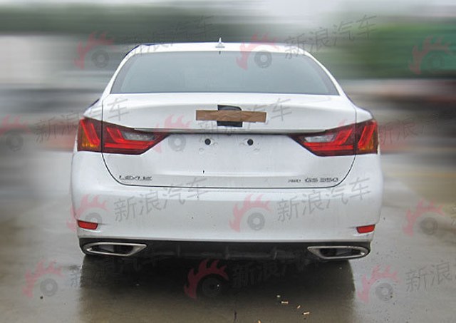
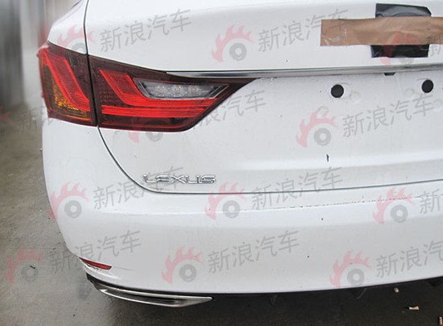
2013 Lexus GS 350 AWD Rear

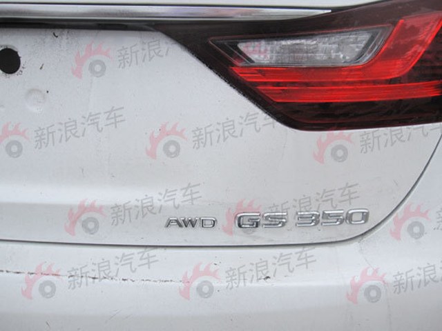
2013 Lexus GS 350 AWD Badge

2013 Lexus GS 350 AWD Badge

Where the rear of the LF-Gh concept mirrored the design lines of the front-end grille, there’s no trace of that in the production GS — in fact, the rear may be where Lexus deviated from the concept the most. Still, I’m loving the integrated exhausts and diffuser, and even with these low-res photos, the taillights look fantastic.

Trying to get a good idea of the GS from these photos is quite difficult — there’s a fish-eye look that distorts the lines of the car, and as mentioned, the Starfire Pearl makes it hard to decipher any sheet metal details, but there’s certainly enough here to carry discussion until the car’s official debut on Thursday.

[Source: Auto Sina (Translated) via Club Lexus] (Thanks 侑鋐 林!)

ChinaFeaturesIn the NewsLexus GS: Fourth GenerationLexus GS: Third GenerationPhoto GalleriesSpy Shots
Comments
Y
  • Y
    Yu
  • August 16, 2011
not impressed at these pictures but you never know...
A
i just hope its not the F- sport 
М
Ok now i do not want that car i need it 
T
  • T
    Travis
  • August 16, 2011
I like it !   The grill isnt as "loud" as I thought it would be.   I dont know about the rest of you guys but I really like the rear end and those taillights with that rear diffuser . Overrall I give the car a 9/10.  With a nice wash and pofessional photos it will be much better.
0
  • 0
    05RollaXRS
  • August 16, 2011
The wheel gaps look painful.
Y
Front end very CT-ish ... and rear end looks like Sonata (the car that I hate a lot) .
Y
Front end very CT-ish ... and rear end looks like Sonata (the car that I hate a lot) .
    М
    i think the rear is much more IS that sonata
    Y
    http://www.drivearabia.com/news/wp-content/uploads/2010/05/2010-Hyundai-Sonata-6.jpg I've just saw a Sonata few hours before , notice where the chrome trim located above the license plate & how much similar the light's shape (I've saw one of my Hyundai fanboy friend complain already , haha) . http://worldmotorpictures.com/wp-content/uploads/2011/06/Lexus-IS-200d-2011-5.jpg Lexus IS's rear is bit more difference than the GS , especially the license plate groove , doesn't have chrome trim & the taillight shape is difference (near side to the license plate) . ANYWAY ... I still love the new GS !
    М
    i got your point  but just if you put chrome over the license plate of the IS plus the new GS rear lights is straight line not as Sonata
    Y
    Yeah ... the bottom is straight line instead of curve , but the taillight that inside the license plate groove is too much like the Sonata , and the chrome trim made it looks even like one , pity Lexus too slow on using that style even their IS already used it .
    T
    • T
      Travis
    • August 16, 2011
    I see no GS in the Sonata. . . .  In the IS yes but Sonata no
    Y
    There's no GS in Sonata ... but there's Sonata on GS .
    Y
    Checked Five-Axis's Lexus GS ... the new GS's rear end design clue isn't from here as well . http://www.auto-power-girl.com/high-resolution-wallpapers/lexus-gs460-by-five-axis/lexus-gs460-by-five-axis-2008-4.jpg But later I remember there's something looks even similar to the Sonata's taillights (for this , I receive more complain comment when I was posting it) . http://2.bp.blogspot.com/-JteywKx0XAg/TitCQHK3OBI/AAAAAAAABw4/gOKpDtcLO5Y/s1600/3+toyota+mark+x+2011.jpg The 2011 Toyota Mark X ... as you can see , the license plate shape & the taillights & the chrome trim is where the Lexus GS learned from .
C
  • C
    Cbwaldo
  • August 16, 2011
I hope it looks better. The car looks like the IS.
B
  • B
    BlackDynamiteMB
  • August 16, 2011
The front lower fascia is much less aggressive than the concept The profile is better than I thought, but the car sits too high. (I'm sure the F-sports and GS-F will be lower).  Wish there was more surface detailing down the flanks.  It looks slab-sided from most angles, but the rocker panels help. The taillights are WILD!  The overall design is pretty tame, but the styling is very original.  Won't be mistaken for anything else! I would say it's on par with the 5 and M, behind the XF, and way ahead of the E-Class in style BD
    Y
    Front end will be different on F-Sport or Hybrid ...
L
  • L
    Lapdrn
  • August 16, 2011
not impressive
J
  • J
    Joe
  • August 16, 2011
...or how crappy pictures in a wrong environment combined with a bad colour choice can completely ruin a car's design... :-/
    M
    • M
      Mike DeLorca
    • August 16, 2011
    Joe----I agree....the surroundings, cameras and void the tape,etc.......this will be fantastic.....I can't wait to see in great light, and with a brilliant silver dressed up with the better wheels....will be a smash !  Don't get all ruffled by these bad shots and tape.  The F-Sport and GS-F will be the best on the road next to the Germans.  Hide and watch !
D
  • D
    Da1brklyn
  • August 16, 2011
Grill is NOT bold like they said it would be design very elementary....and i love lexus just not inspiring
A
  • A
    Andrh
  • August 16, 2011
Beautiful. Nice wheels and tires will make it look nicer, believe me!. Now, comparing the front of this car with first picture release form it, the front bottom  grill is missing some piece of chrome. without that little piece of  chrome, this car lose character, let's hope this is not the final product. Overall, this design show us the new Lexus Direction and  we can confirm how Lexus ct design influenced on new  Lexus GS.
    R
    • R
      Richard
    • August 16, 2011
    Take another look at the original Teaser photo... you can see where the thicker Chrome part of the grill surround teminates; the rest of the highlight around the lower part of the opening is just clever lighting... I had to take a second look, too.
    A
    • A
      Andrh
    • August 16, 2011
    yes, you are right. But it would be nicer if it was like that. 
    R
    • R
      Richard
    • August 17, 2011
    I liked the full chrome surround look, too... but then too many people would complain that Lexus stole that detail from Audi... maybe they will use it on the Hybrid or F Versions.   I really wished they'd get away from the round fog lamps (they look less integrated, and old/dated)... I loved the original IS fog lamps in the triangle openings; then, they ruined the face by going to round (First with the IS-F, then the IS-C and regular model)... oh well.
B
  • B
    BlackDynamiteMB
  • August 16, 2011
This is the BASE CAR styling. With F-Sport, Hybrid, and GSF, there is plenty of upside potential Definitely can roll with the competition, apples to apples BD
  • Anonymous
  • August 16, 2011
Like the new BMW 5-series, this isn't a bad looking car, and like the new BMW 5-series, it's a bit bland at the same time. I'm going to need some time to get used to seeing the Lexus L-insignia on it!
V
  • V
    Vogel
  • August 16, 2011
OMG. It looks really poor. I think I will go for a 5series BMW.
L
I love it! The  (very) wide-angle lens used does distort the proportions and shapes a bit and make it look a bit chunky,but proper photos are only a few days away. Looking at the photo taken from the right side,I'm even more convinced a coupé would be a great idea.
B
  • B
    bobby
  • August 16, 2011
i really wanted the more exotic tail lamps from the concept, i dont like how this looks like sonata a little too much, but ill def wait for more professional pics
    T
    • T
      Travis
    • August 16, 2011
    The tail lamps look awesome. They look way better then the Sonatan tail lamps. They design came from the CTh tail lamps.... plz dont use the Sonata and Lexus GS in the same sentence. . . .
    B
    • B
      bobby
    • August 17, 2011
    i dont want to really. i would take a the lexus over the son– sorry wont say it :D
    B
    • B
      bobby
    • August 17, 2011
    i dont want to really. i would take a the lexus over the son– sorry wont say it :D
J
  • J
    Joseph
  • August 16, 2011
wait why does it say lexus on the rear? didnt they eliminate that through all the models in 2011? or was that only the us? 
    • Anonymous
    • August 17, 2011
    Just the US (:
    D
    • D
      D4
    • August 17, 2011
    Why would they eliminate the Lexus sign at the back?? In my opinion it's very good
    • Anonymous
    • August 17, 2011
    I agree; it's beautiful, but Lexus thinks it's too good for one. aha Lexus feels that it has enough recognition here in the US. The funny thing is that Mercedes-Benz and BMW vehicles still have their names written on every car, but it's "tradition".
    M
    • M
      Mike DeLorca
    • August 17, 2011
    I have same question and thought------Lexus was to delete the Lexus emblem that is spelled put leaving only the "L" on the rear.  What happend?????
H
  • H
    Hube
  • August 16, 2011
I'll wait for the official pics before I make up my mind. Thanks for sharing Krew!
M
  • M
    Max_bramante
  • August 16, 2011
Personally I'm totally agree with who says that this is the basic version and the ugly pics and the wrong environment make the rest, I bet this car will look great, I'm just a bit down cuz I had been on Autoblog and the 95% of the comments are totally negative, that make me sad although it happened the same with the 2012 bmw 1er.
    B
    • B
      bobby
    • August 17, 2011
    dont worry, the autoblog commenters are the most ignorant people haha
    M
    • M
      Max_bramante
    • August 17, 2011
    But I don't get it: they are americans for the larger part?
    М
    i know they are Americans , i have 2 but point 1)but they are not all the Americans 2)but Lexus design the GS to be well shaped for the world wide customers not only NA as before
V
  • V
    V12mind
  • August 16, 2011
I don't know about anybody else, but I am kind of relieved that it isn't as ugly as I thought it would be.  I never liked the concept version, I'm glad they toned it down.  On the other hand, it looks pretty bland and generic.  I am not as attracted to it as I was the S190 generation.
L
  • L
    Lexisf
  • August 16, 2011
Hmmm, ill pretend i never saw these pics and pray that the car at pebble beach gives me some wow factor! I love lexus but in these photos it looks half over sized CT200h and half miniture LS460?! And please Lexus can we make some attractive wheels!.... Cant wait to see the F-Sports model.
W
  • W
    Walterdwilliams
  • August 17, 2011
You never can fully know what a car looks like until it is seen in 3D in person. I thought the current IS looked weak until it arrived at the dealership and was amazed at the lines. Plus Lexus will always keep their basic look, it's their MO.
A
  • A
    Andrh
  • August 17, 2011
I find this GS more similar each time to this one than the one at ny auto show http://lexusenthusiast.com/2011/02/18/2012-lexus-gs-photochops/
    М
    yeah i even think if the BC magazine are accurate with the GS by 90% - 95% that means that this is the next IS http://jp-cardesigncorner.blogspot.com/2011/02/all-new-lexus-is-f-coming-in-2012.html http://jp-cardesigncorner.blogspot.com/2011/01/lexus-readies-new-is-hybrid-version-to.html and that's will be the next LS http://jp-cardesigncorner.blogspot.com/2011/04/another-impression-of-2013-lexus-ls.html http://jp-cardesigncorner.blogspot.com/2011/02/all-new-spicy-lexus-ls-coming-in-2013.html
K
  • K
    Kaivo Soo
  • August 17, 2011
dont like. front is too CT and  back is too overtyled. Big pipes  .... maybe  white is good color for this.
M
  • M
    MarkC
  • August 17, 2011
This looks awesome!!!!  I can't wait for it to come to the US if will out sell the 5-series and E-class easily.  Watch for the GS-F that is going to blow everything away!!!
V
The grey wheel looks awesome on Starfire Pearl
D
  • D
    D4
  • August 17, 2011
It looks good and clean, although these photos aren't exactly what you would call model photos, crappy color, environment, photo quality etc.. At night the rear lights should stand out..
L
I'd love to see it in starlight black with the red and black leather interior. :-D

L