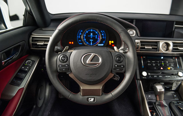
Yesterday, we took a closer look at the 2014 Lexus IS exterior, and now it’s time to examine the interior using photos from Autoblog’s extensive photo gallery — let’s start in the driver’s seat:
The steering looks like a combination of the GS & LFA, with new controls for the audio system, telephone & voice control on the left and a circular navigator for the instrument panel display on the right (along with dynamic radar cruise control) — also visible are the new Lexus control stalks first seen in the new GS.
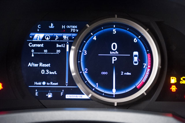
The biggest interior feature in the IS has to be the LFA-inspired circular instrument panel:
Just like the LFA, the metal circle moves left & right to reveal menus and options — there’s some definite WOW factor to this feature, and will be the first thing new owners will show off.
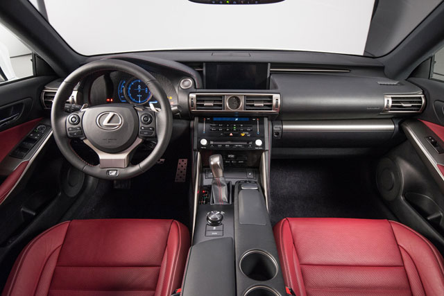
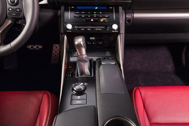
Next up, the center console:
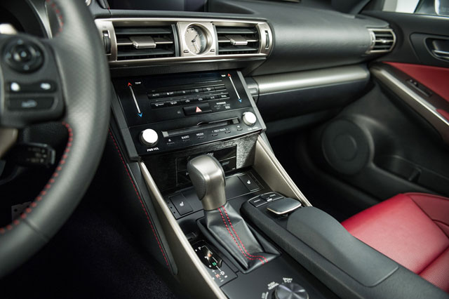
The main navigation display appears to be the same 8-inch navigation screen from the new ES, let’s zoom a little closer on the main control stack:
While it shares the same analog clock as all new Lexus models, the temperature & radio controls are brand-new & unique — most notable are the electrostatic switches to control the temperature with the touch of a finger.
Right down the center console, the IS has the Remote Touch and Drive Mode Select controllers:
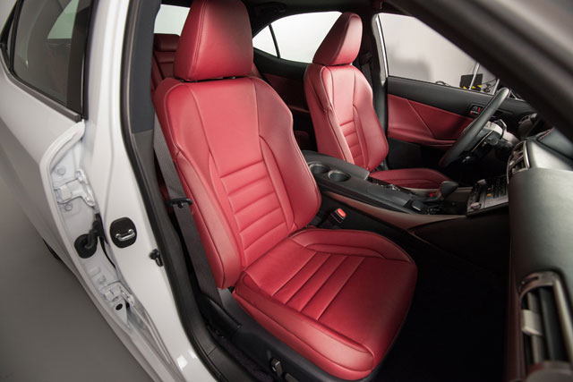
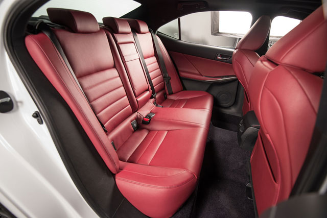
The new seats look great in the Rioja Red leather, both front & back:
The rear seats have 60/40 split and fold down — this along with the increased rear room makes the back of the IS much more functional than the outgoing model.
All in all, the new IS interior is a huge step forward. From these photos, it looks comparable to the new GS in quality, which stands as my favorite Lexus interior ever — can’t wait to see it next week in Detroit.

Comments