You are using an out of date browser. It may not display this or other websites correctly.
You should upgrade or use an alternative browser.
You should upgrade or use an alternative browser.
Second Generation Toyota Mirai
- Thread starter Motor
- Start date
mikeavelli
Moderator
- Messages
- 7,537
- Reactions
- 16,739
I'm in love with this...
Trexus
Founding Member
- Messages
- 661
- Reactions
- 955
I'm in love with this...
I love the next generation Mirai as well...was at the L.A. autoshow and saw the new Mirai in person and have to say it has lots of presence, form and love the blue...can't wait to see it in action and in the wild...
CRSKTN
Expert
- Messages
- 2,441
- Reactions
- 4,067
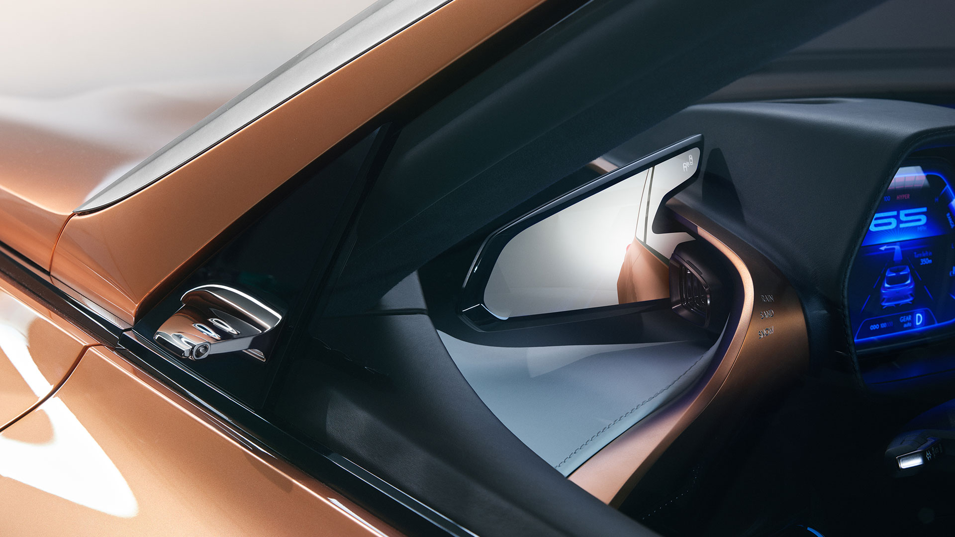
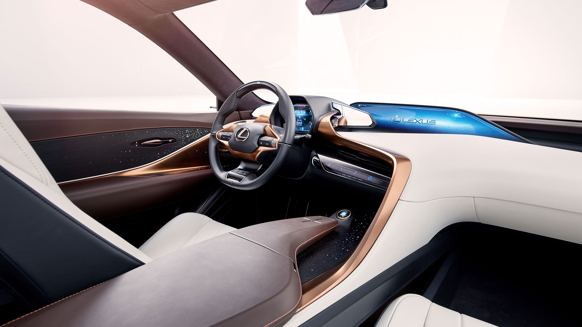
Not sure if these have been shared here yet, but I stumbled upon some images of the GS - I mean Mirai - that I haven't seen before:


That interior with the white dash. Panoramic roof. Are you f'ing kidding me...
Upscale the materials a bit and this is a GS... they probably butchered the design to turn it into this exterior.
After looking at the new G80, if Lexus had this as the new GS out and properly styled, if you could afford it who wouldn't go for the GS?
Gecko
Administrator
- Messages
- 5,169
- Reactions
- 12,765

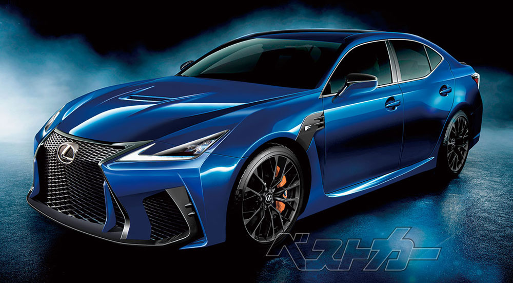
Remove the F extras and... yeah...
I believe that 5GS render was fairly legit, and an early leak in the GS project before it was killed and turned into the Mirai. There was even an interview - I think in 2017? - and the Gazoo Racing team said they were working on the suspension for the next gen GS or GS F.
CRSKTN
Expert
- Messages
- 2,441
- Reactions
- 4,067


Remove the F extras and... yeah...
I believe that 5GS render was fairly legit, and an early leak in the GS project before it was killed and turned into the Mirai. There was even an interview - I think in 2017? - and the Gazoo Racing team said they were working on the suspension for the next gen GS or GS F.
Holy dang that is dead on as far as renders go.
This would have done it for the GSF if the performance was there too and had that sort of interior. They had it. They freaking had it and cowered away from the risk.
Gecko
Administrator
- Messages
- 5,169
- Reactions
- 12,765
@Carmaker1 gets the original credit for seeing the similarities between that render and the production Mirai.


Remove the F extras and... yeah...
I believe that 5GS render was fairly legit, and an early leak in the GS project before it was killed and turned into the Mirai. There was even an interview - I think in 2017? - and the Gazoo Racing team said they were working on the suspension for the next gen GS or GS F.
i dont have an eye for these things, but exterior of 5GS-F just looks like updated GS-F, look at that trunk, it is same as 4GS.
On the other hand, Mirai does not look like 4GS at all, not a single bit.
When it comes to the interior, it is clearly Lexus interior with current gen infotainment but next gen interior design, maybe some surfaces are more plasticky than they would be in GS but certainly best Toyota interior ever.
Maybe it's the copper/rose gold accents, but I see a lot of influence from the LF-1 Limitless in the Mirai interior:


yep... definitely a Lexus interior.
Just get all of that hydrogen stuff out, get some batteries in that and it’s perfect👌
Those seats look incredible.
i dont have anywhere to charge those properly, so what about 3.5 TT Hybrid with 40 miles of EV mode and overall 500hp?
That interior design is almost perfect apart from one thing. The driver-side AC outlet is enormous! They should have thought it through and consider possibility of integrating digital rear view mirror screens into the design. That's a missed opportunity.
CRSKTN
Expert
- Messages
- 2,441
- Reactions
- 4,067
Maybe it's the copper/rose gold accents, but I see a lot of influence from the LF-1 Limitless in the Mirai interior:


Shameless.
Ian Schmidt
Moderator
- Messages
- 2,409
- Reactions
- 4,249
Maybe it's the copper/rose gold accents, but I see a lot of influence from the LF-1 Limitless in the Mirai interior:
To my eye they're both drawing to an extent from the RX, especially the mini-wall on the side of the center console.
The doors are basically straight off the LS though.
CRSKTN
Expert
- Messages
- 2,441
- Reactions
- 4,067
That interior design is almost perfect apart from one thing. The driver-side AC outlet is enormous! They should have thought it through and consider possibility of integrating digital rear view mirror screens into the design. That's a missed opportunity.
They did probably think it through... for the GS. I guarantee you that the entire black plastic form from the left vents to the screen on the right looks like a hack job because it was one to some extent.
If I had to guess:
It was going to be an early implementation/move towards large, possibly non-standard form factor screens (see their concept cars), that double as digital side mirrors.
Given the quality of execution in the design elsewhere, i just can't see those same designers thinking hey, we need an H20 button and a vent on the left, maybe we should make a giant, oddly shaped, underutilized slab of vertical plastic to your left.
That area was obviously intended for something else to begin with. There's no reason for the vents to need to be on a perfectly flat, mostly vertical surface that mirrors nearly perfectly what's used for the center display. They could have just taken the design from the right hand side, and mirrored it I have a feeling they were going to try and do some interesting stuff with their displays in the GS, but cut and simplified components for the Mirai.
What an absolute waste of a good car. Absolute waste.
Will1991
Moderator
- Messages
- 1,630
- Reactions
- 3,327
Gecko
Administrator
- Messages
- 5,169
- Reactions
- 12,765
Not to beat a dead horse - I'm over the demise of the GS - but for a business case, doesn't it make more sense to have an alternative fuel hybrid come from a premium brand? That was the whole point in Toyota's strategy shift with the Mirai - to make it more premium because you can't sell an econobox for $45k, no matter what.
Seems to me like deleting the Mirai, having the ES as Lexus' defacto midsize sedan and pivoting to make the GS a premium tech showcase (and being able to charge a premium) would have made the most sense. That would have thrown Lexus into the conversation they are currently absent from with the likes of Tesla and the Germans around alternative powertrains.
Seems to me like deleting the Mirai, having the ES as Lexus' defacto midsize sedan and pivoting to make the GS a premium tech showcase (and being able to charge a premium) would have made the most sense. That would have thrown Lexus into the conversation they are currently absent from with the likes of Tesla and the Germans around alternative powertrains.
CRSKTN
Expert
- Messages
- 2,441
- Reactions
- 4,067
Not to beat a dead horse - I'm over the demise of the GS - but for a business case, doesn't it make more sense to have an alternative fuel hybrid come from a premium brand? That was the whole point in Toyota's strategy shift with the Mirai - to make it more premium because you can't sell an econobox for $45k, no matter what.
Seems to me like deleting the Mirai, having the ES as Lexus' defacto midsize sedan and pivoting to make the GS a premium tech showcase (and being able to charge a premium) would have made the most sense. That would have thrown Lexus into the conversation they are currently absent from with the likes of Tesla and the Germans around alternative powertrains.
The GS should've really been a statement model. I can't imagine who would pay for the Mirai and not prefer to have it as a Lexus level product and service instead.
I imagine this is partly because the fuel cell infrastructure is primarily in Japan, where the Toyota brand likely will have less of a negative impact on it since they already have different toyota stores for different "classes" of vehicles.
-
This site uses cookies to help personalise content, tailor your experience and to keep you logged in if you register.
By continuing to use this site, you are consenting to our use of cookies.

