Two weeks ago, I was invited to test drive the all-new 2013 Lexus GS in Dana Point, California. This is the second part of my review — part one can be found here.
Moving on from all the technical talk, it’s time to take a closer look at the major changes to the exterior design of the next-generation Lexus GS.
Now, as the new “face” of the Lexus brand, there’s no question that the spindle grille is the most significant design change overall, but there’s something else that I believe is much more important to the GS model.
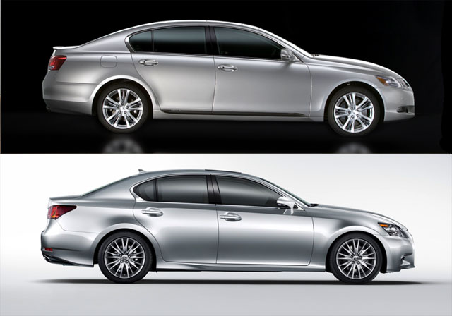
Let’s compare the side profile of the third-generation GS and the new fourth-generation GS, with attention on where the back window meets the trunk:

The change is subtle, but meaningful — by moving the roofline forward, Lexus engineers were able to increase headroom in the rear seats and space in the trunk, and perhaps even more importantly, gives the GS a more conventional shape.
The family resemblance is important — the GS no longer feels separate from the rest of the Lexus lineup, and instead fits in perfectly as the mid-size model between the IS & LS. This in turn gives the GS a much clearer identity, and solves perhaps my biggest issue with the previous model.
Of course, the new spindle grille and the entire front-end remains the exterior design highlight:

Being the vanguard for a new design direction is a tough job for any vehicle, and this is second time in a row that the GS has been called on to do exactly that — first, with the entire L-Finesse design language in 2005, and now with the new front-end design that will make its way through the entire Lexus lineup in short order.
As with almost anything new, judgements have been quick and ruthless, but I have two points to temper all the controversy. First off, as someone that writes about Lexus all day every day, I’ve been staring at this new front grille for three months now, and my initial trepidation has been replaced with an appreciation of the direction Lexus designers are taking — essentially, it takes time to get comfortable with something new.
I feel confident saying this because of one very important fact — the new GS, and especially the front end, looks sooooo much better in person. Photos appear to sharpen the front-end to a point, whereas in real life the car has a strong, wide stance (likely from the extra two inches in width) that puts the entire design into proportion.
All of this results is an exterior that has a way of growing in its appeal and sets a new tone for the brand — exactly what you want with a design that will dictate the lineup’s look for the foreseeable future. In fact, a recent comment from Lexus Europe’s vice president Andy Pfeiffenberger sums it up perfectly for me:
“We’ve been vanilla long enough. If some buyers don’t like the new GS’s design, that means we’re doing the right thing.”
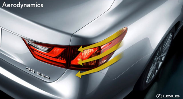
To close out the exterior design talk, there’s one minor element I wanted to point out — there’s these two fins on the rear tail lights that help direct the air around the rear of the vehicle:

I love these little details that Lexus engineers work into their designs — they always end up being my favorite elements of the vehicle.
Up next: The all new GS interior.

Comments