Read more…

" /> Imagining the Next-Generation Lexus GS – Lexus Enthusiast | Lexus Enthusiast

Imagining the Next-Generation Lexus GS


Master photochopper Theophilus Chin has put together his best estimate of what the next-generation Lexus GS could look like, and I think he’s right on the money:
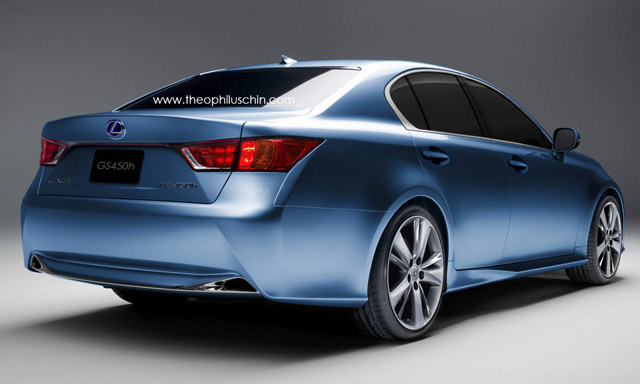
2012 Lexus GS by Theophilus Chin Rear

By blending the LF-Gh with the other recent design cues we’ve seen with the refreshed 2011 IS and CT 200h, I think Chin has been able to hit very close to what we can expect to see with the next-generation GS.

I’m still forming an opinion on the front-end — it might be a little too close to the CT, though it wouldn’t be all that surprising to see something very similar on the production model. There’s definitely a push by luxury car manufacturers to chose a general overall design and then spread it straight through the entire market.

Have to say, I really like what Chin’s been able to do with the rear of the LF-Gh — by bringing in the current IS rear light design, it’s really brightened up the back. Add in the door handles and side-mirrors, and the car starts looking much more like a modern, next-generation Lexus.

[Source: Theophilus Chin]

F SPORTFeaturesFutureLexus GS: Fourth GenerationLexus GS: Third GenerationPhotochops
Comments
W
  • W
    Walterdwilliams
  • April 25, 2011
I agree...that is probably as close as we can expect to see the finished product. I bet it will look great in person.
Y
He did a lot of photoshop on car though , especially rendering those future car ... he also did photoshopped a production CT200h before it really came out .
    K
    • K
    • April 26, 2011
    Theophilus Chin is super-talented, especially when it comes to figuring out how the production car will look based on the concept.
M
  • M
    mrxandthexfactor
  • April 26, 2011
That's fairly good looking. Thing is though, the front will look a bit more like the front fascia of CT. The CT design has already incorporated that spindle-shape grille.
Y
  • Y
    Yesh
  • April 26, 2011
I would say this is pretty close to how the GS would look. Also looks very similar to the pic that has been floating around. Unfortunately it looks neither elegant nor aggressive. In the current market the design is way too plain and dull. The BMW also looks pretty plain but there is an elegance to it.The market is getting very competitive, it is no longer 5, E and GS any more. The Audi A6 looks amazing inside and outside. The current gen IS, GS and LS all look good. Simple, elegant and luxurious. Lets hope the interior and powertrain options are mind blowing else this segment is lost.
    K
    • K
    • April 26, 2011
    I don't know, I'm not a huge fan of the new BMW look -- very bland to me. I do have to agree with you about Audi, they've put together a fantastic lineup. You bring up a good point as well -- we still have to see the interior AND find out about the powertrains. Plenty details left.
E
  • E
    emptystreets130
  • April 26, 2011
It's not bad. I'm actually liking this. The rear end reminds of the 2dn gen Mark X but a lot cleaner. I approve.
  • Anonymous
  • April 26, 2011
I hope Lexus designers aren't that lazy... even without the hype about how great this car is from all those who already saw it, I'd doubt I would ever be impressed by this design. sigh... I must wait...
    • Anonymous
    • April 26, 2011
    I agree... Im not exactly in love with this chop. I hope the production GS doesn't come out like this
W
  • W
    Wunko
  • April 26, 2011
I like the rear end on this better than the concept's rear end, minus the amber turn siganls. I wish the front wouldn't look so much like the CT though.
P
  • P
    Pgr3boy
  • April 26, 2011
Lexus always look better in flesh then every other auto manufacturer, Audi looks nice on photos, but in reality Lexus always looks nice, refined and elegant
    K
    • K
    • April 26, 2011
    Agree completely, Lexus always looks better in real life. It's one of the strangest things about their designs.
F
  • F
    FooFoo
  • April 26, 2011
Very similar to the current Honda Accord. The concept is too exciting. The real model is too bland.
F
  • F
    FooFoo
  • April 26, 2011
Very similar to the current Honda Accord. The concept is too exciting. The real model is too bland.
B
Very good work; a talented photoshopper. I prefer this version. I wouldn't mind seeing some other colors while we're on the subject of photoshop...
L
It´s a nice photoshop job,but I prefer the bolder,more agressive look of the concept.
E
  • E
    enthusiast
  • April 26, 2011
I agree this is a very good interpretation of what the next GS is going to look like. I think it looks better than the LF-Gh concept. But I don't understand a couple of the design cues; why does the character crease running down the side appear to dip down just aft of the rear door? Maybe it's just a trick of the light, but it looks ridiculous. That lower grille just looks like a gaping jaw, or like old man jowls. And why the side-step looking ground effects? I can see the bottom of your pants getting filthy every time you get in or out of the vehicle. Plus it's just not a very elegant look. I much prefer the stainless steel accent on the current GS. Other than that it's just too blah, with very little in the way of visual interest. They don't need to add a bunch of creases and lines and other garbage like on the new Mercedes E-class; but the Audi A6 seems to have gotten it just right. I was so looking forward to buying the new GS, but now I'm pretty sure I won't unless the actual product is much different than this.
    K
    • K
    • April 26, 2011
    I'm not sure what's going on with the character line dip at the rear door -- on the CT, that line just fades into the rear wheel shoulder: http://img2.netcarshow.com/Lexus-CT_200h_2011_800x600_wallpaper_29.jpg I also wouldn't think the ground effects would be as pronounced as they are in Chin's photochop.
S
  • S
    Steven
  • April 26, 2011
I don't really like the rear. I hope it ends up looking more like the concept's rear. And the front headlights are very plain looking. It looks like the 2010 hyundai sonata's headlights. I kinda hope that the grille will be exactly like the concept's grille and make it span the entire front end. Oh! Maybe the GS-F performance model will have the giant grille instead of the normal sedan!
B
  • B
    BOSS
  • April 26, 2011
This is boring as hell. But good thing it's photoshop though ahah
S
  • S
    sndesign
  • April 27, 2011
Here's a real world chop courtesy of me, looks better.
    K
    • K
    • April 27, 2011
    Looks great -- nice work! Would you mind if I posted it up on the site?
    S
    • S
      sndesign
    • April 27, 2011
    I don't mind at all, go right ahead!
    S
    • S
      sndesign
    • April 27, 2011
    You can use the one attached below, the mirror is slightly larger and more true to life.
    M
    • M
      Mike DeLorca
    • April 27, 2011
    Beautiful-----Lexus needs you my friend ! Fantastic and what the GS needs to carry on with---now see what you can do th help the rear end more.
    S
    • S
      sndesign
    • April 27, 2011
    Here's a quickie of the rear, can't do much about the lighting details since that will take forever! But I think the tailight shape will be more true to the concept than the renderings in the original post.
    K
    • K
    • April 27, 2011
    Thanks!
T
  • T
    TF109B
  • April 27, 2011
They're supposed to keep the grille that was on the concept, aren't they? So why does the main chop not incorporate that design? The new grille looks worlds better and the last chop put up shows you how aggressive it looks in comparison.
    K
    • K
    • April 27, 2011
    I think the actual grille we see on the LF-Gh will be reserved for the GS-F/GS F-Sport -- I would expect the standard GS to have something similar to the CT 200h.
L
  • L
    ls460fan
  • April 27, 2011
i am really disapointed with this photochop, the rear is not bad but the front looks bad, it looks so simple and it is not what a lexus should be, the photochop that sndesign published is one of the greatest, and offcourse i hope it looks like it....we have to wait and see..
L
  • L
    ls460fan
  • April 27, 2011
i am afraid that this grille is gonna be on lexus future cars because it is stupid, why would any one buy this car if there is a ct200h they have the same grille and other things, please lexus dont make this one, when you made the ls460 it was so good and even with the facelift in 2010 it looked better and the current "IS" looks so good, stay on this line......
B
  • B
    BlackDynamiteMB
  • May 11, 2011
Looks better than the E-Class Not as good as the M or XF Lexus concept designs don't really carry over directly to production The LFA doesn't look anything like the concept car BD

B