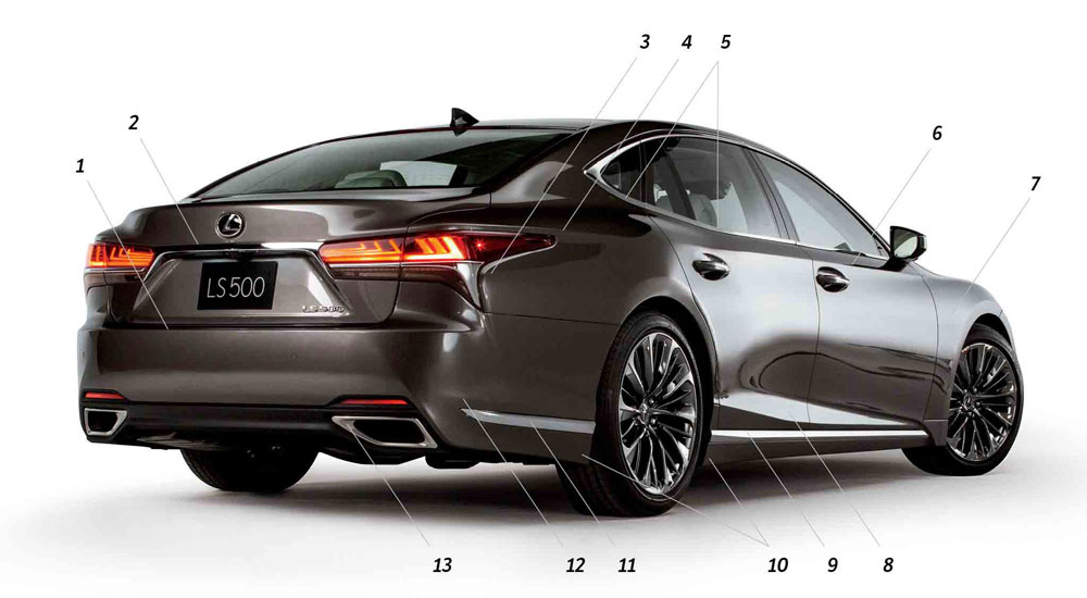
Automobile Magazine longtime design critic Robert Cumberford has turned his eye on the new fifth-generation Lexus LS:
At first glance this big, powerful modern car reminded me of a 1957 Buick Roadmaster. Not because of any specific details, obviously. But both cars are strongly assertive, their grilles complex assemblages of an enormous number of discrete pieces, far bigger than necessary for cooling the mechanisms behind them but impressive in their massive presence.
If both cars look very heavy, I believe it is by intention.
The thick-pillared, nearly flat-sided body seems to press down heavily onto a perfectly flat base plane. There’s a strong horizontal theme to the LS, emphasized by the hard chrome edges at the bottom of the front end, carried back along the sills by a straight chrome trim piece.
Regardless of his final assessment (“I see this design as an esthetic mess”), Cumberford delivers a thorough critique of the new LS — his point-by-point design analysis is always an interesting read.

