Last week, Lexus Enthusiast traveled to Santa Monica, California, to see the updated 2020 RX crossover in person. These are the first impressions of site editor Kevin Watts.
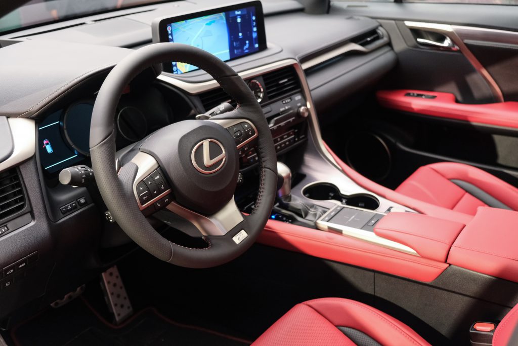
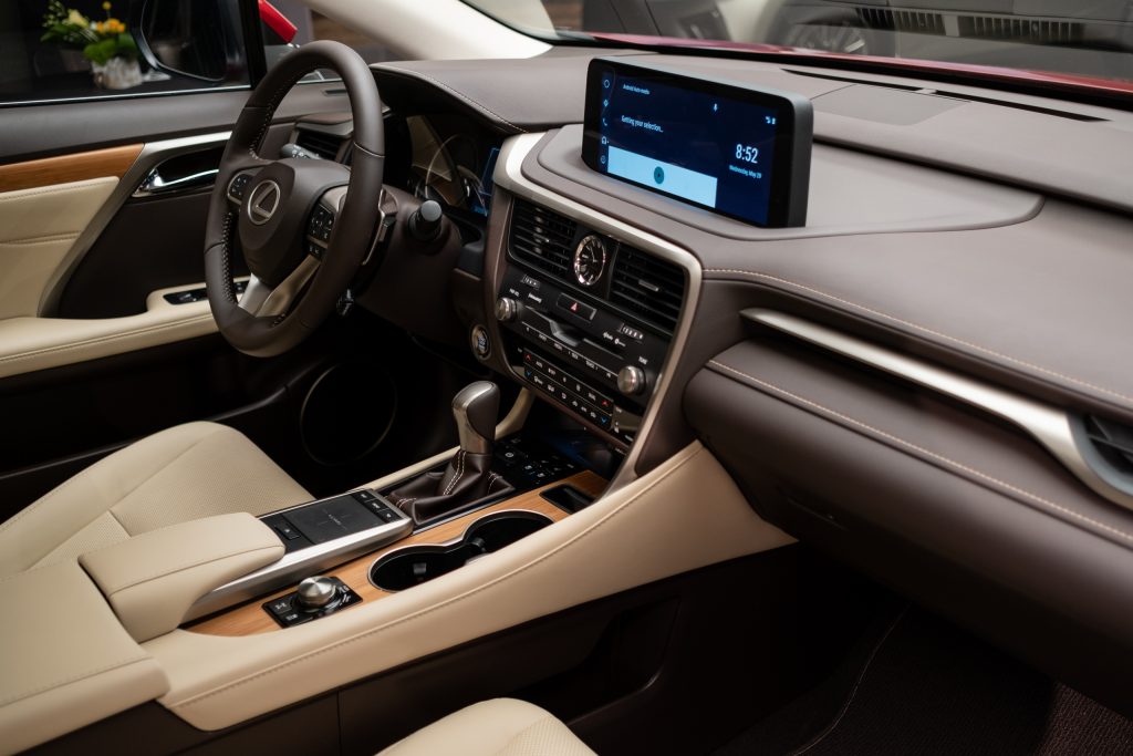
A major course correction for Lexus interior design is upon us, and it’s debuted in the most unlikely of places — the RX crossover has been updated for the 2020 model year, and it’s brought back the touchscreen.
It’s a fitting vehicle for the change, considering the third-generation RX from 2010 was the first model to feature the Remote Touch joystick controller.
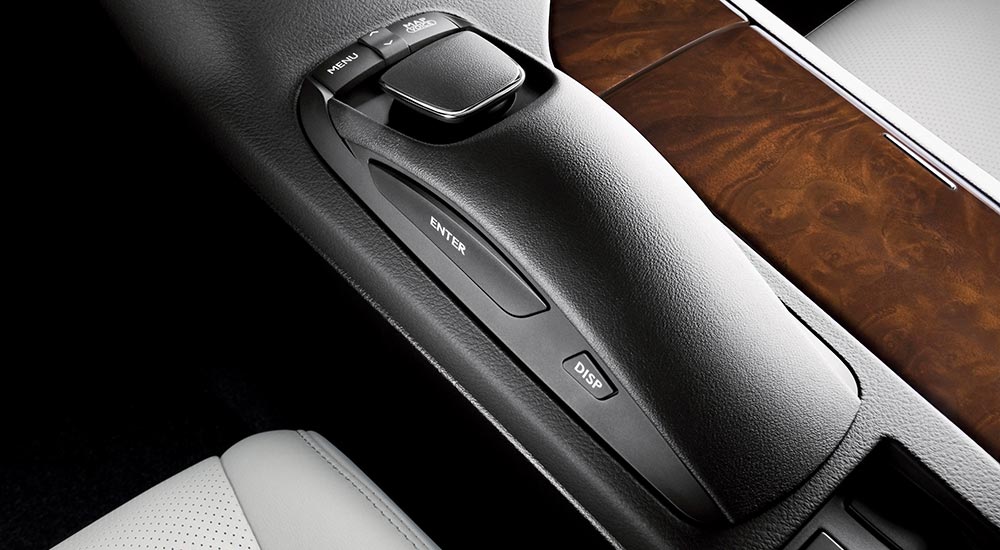
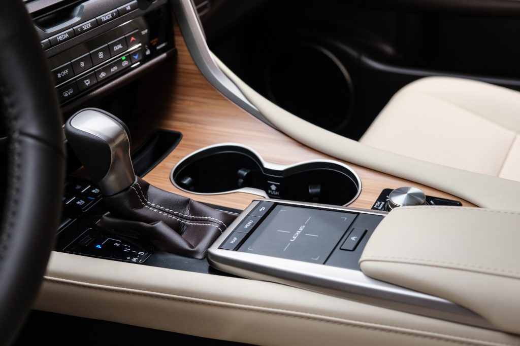
The concept was strong at the time, moving the screen into the driver’s sightline and mimicking the mouse control scheme used on every computer. But it never quite worked as planned — the navigation didn’t translate well into a car cabin and owners have found Remote Touch to be passable at best and frustrating at worst.
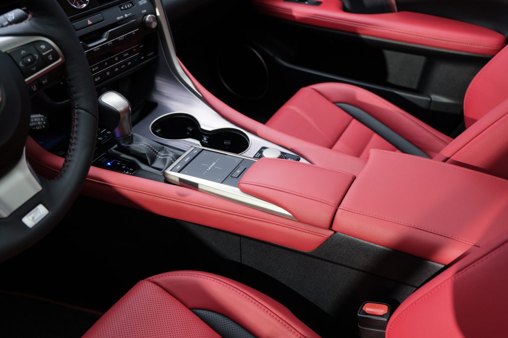
To that end, the RX reintroduces the touchscreen that was abandoned in favor of Remote Touch. Being a minor-model change, Lexus designers had to work within the confines of the existing cabin, which required compromise. The infotainment screen has been pushed 5.4-inches closer to the driver, resulting in an interface that requires some awkward movement but is much better than the Remote Touch alternative (that still exists in the center console as a fallback).
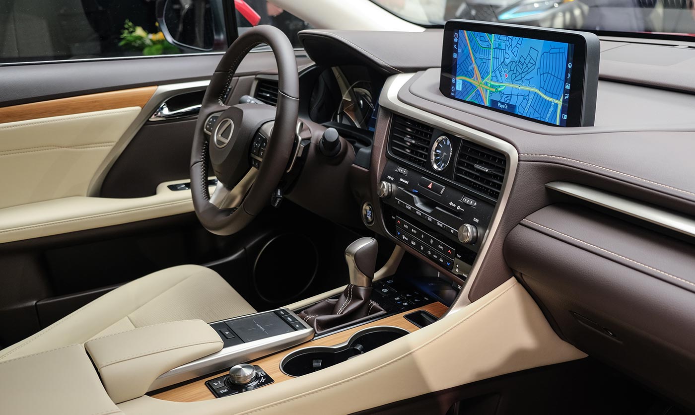
All of this would mean nothing if the software behind the touchscreen wasn’t up to par, and with the inclusion of Android Auto alongside Apple CarPlay, Lexus has brought themselves level with every other auto manufacturer. Interactions with both systems (and the standard infotainment software) are fluid and responsive, just like using any modern tablet.
Lexus executives would not confirm if the rest of the lineup would also be making the switch, but Lexus does not play around with its best-selling model. My guess is that touchscreens will be a cornerstone of all Lexus interiors moving forward.
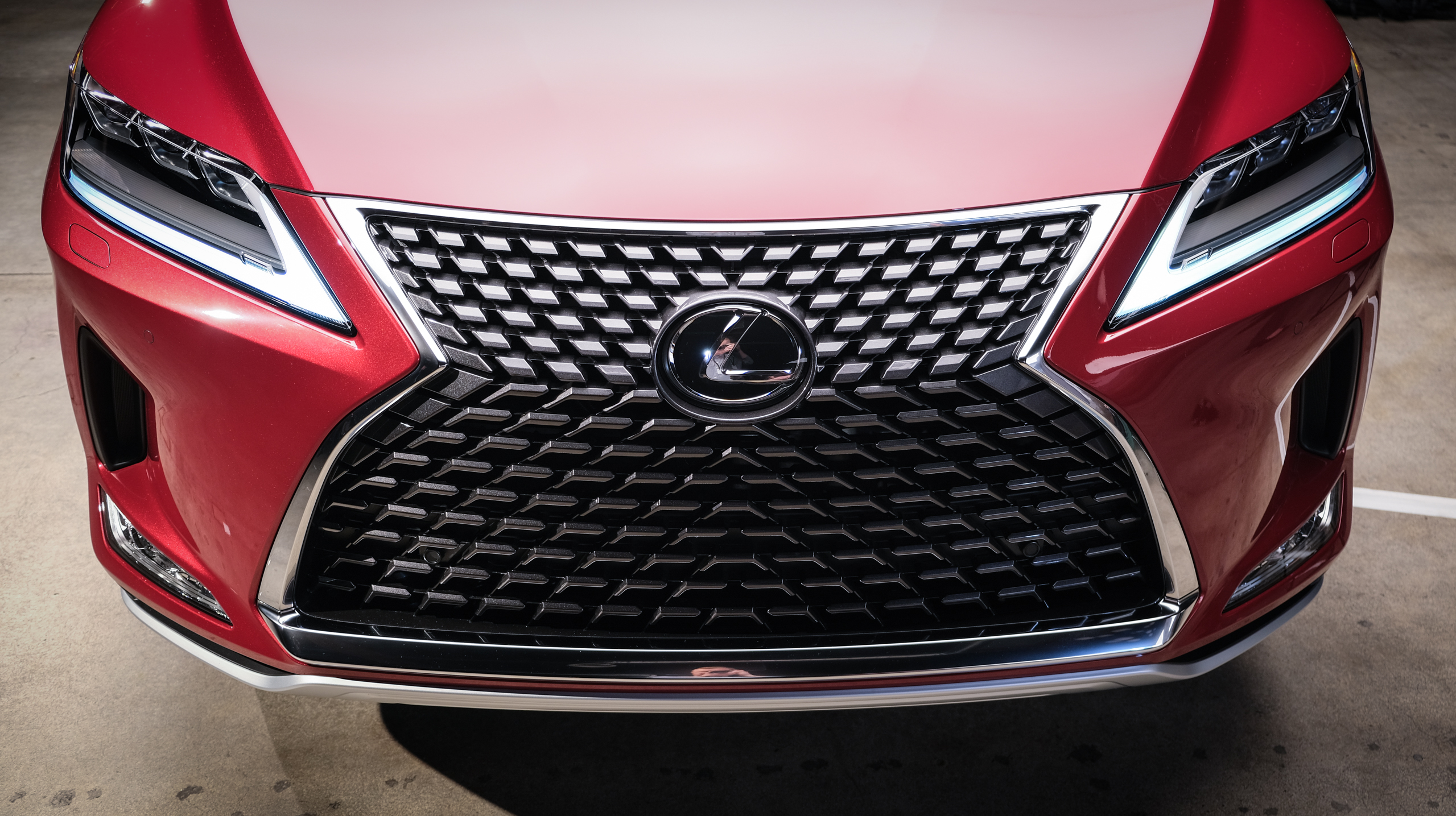
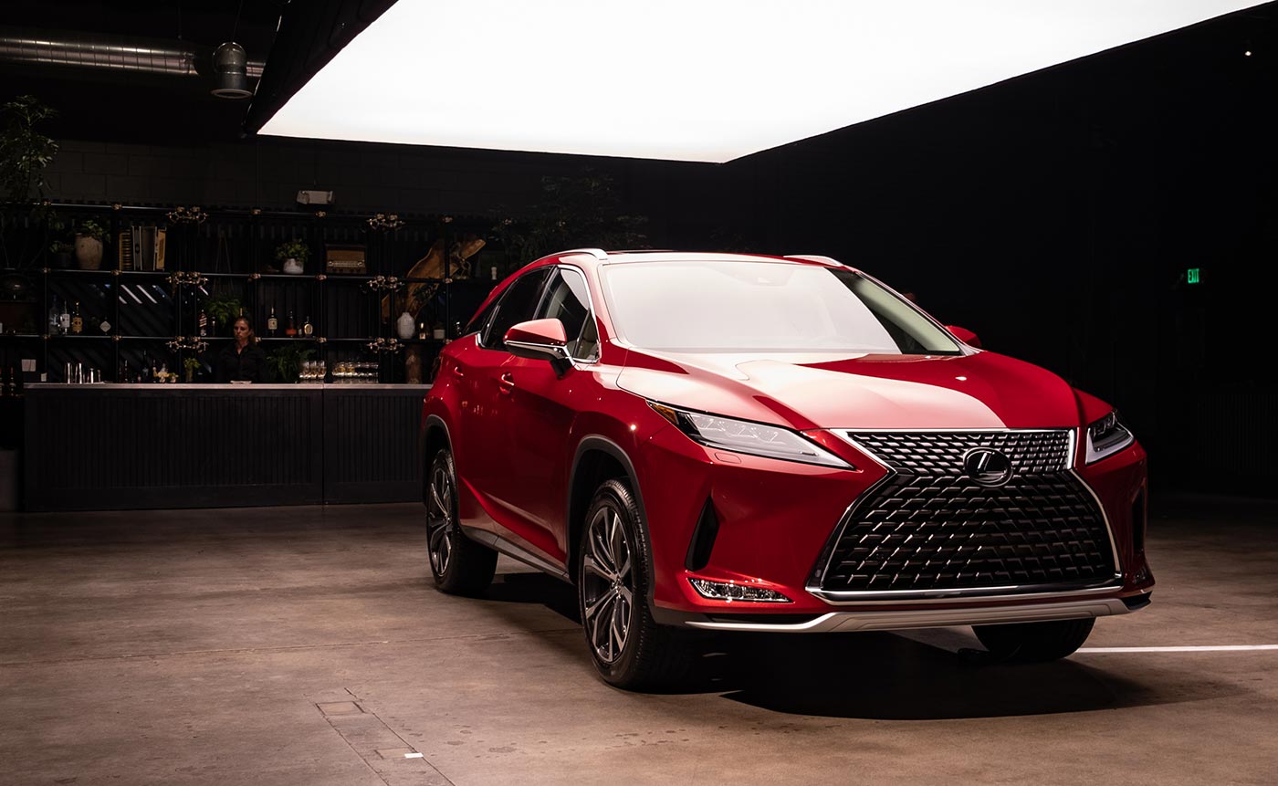
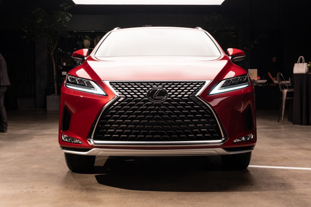
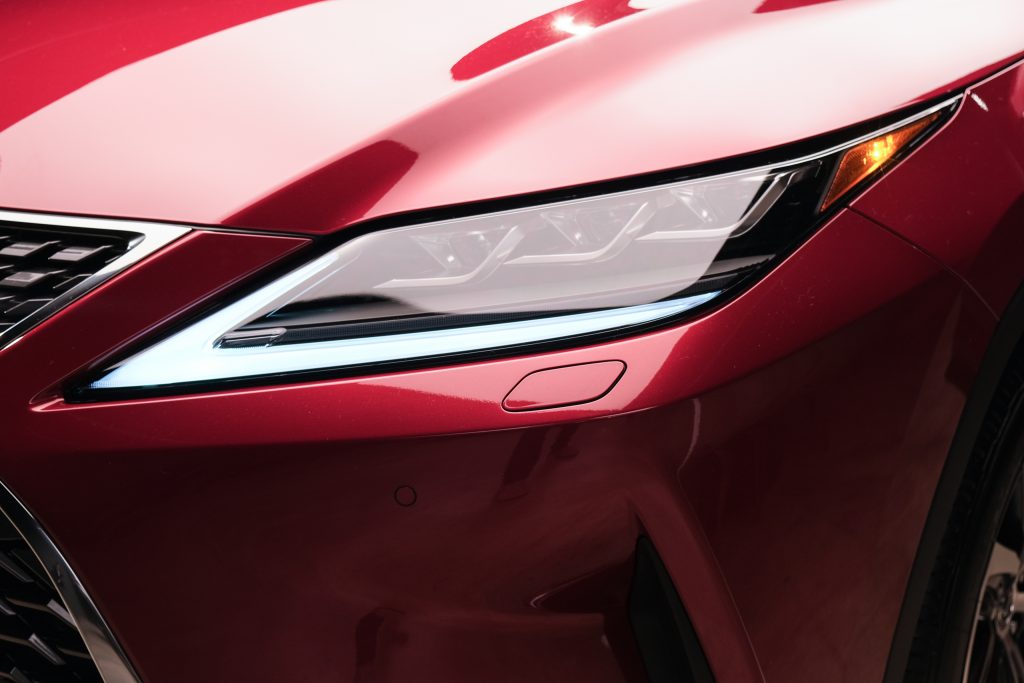
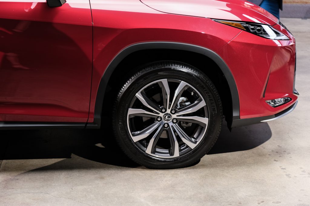
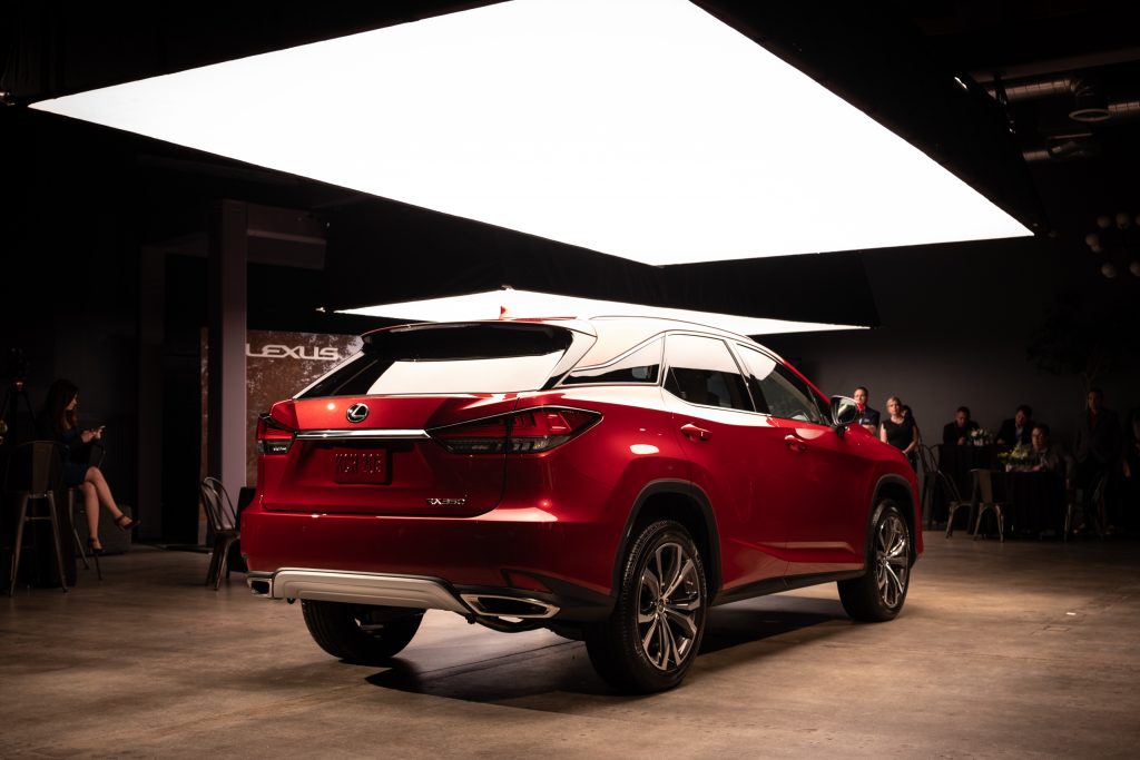
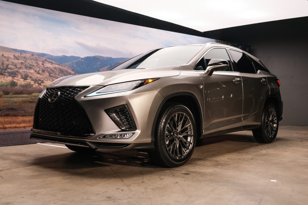
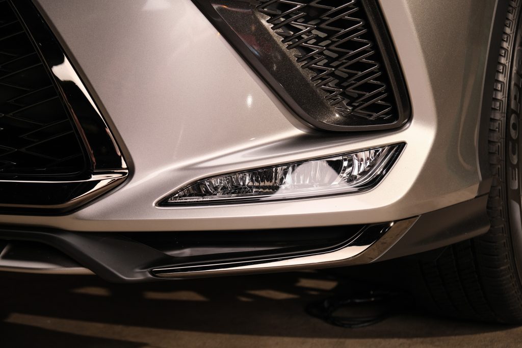
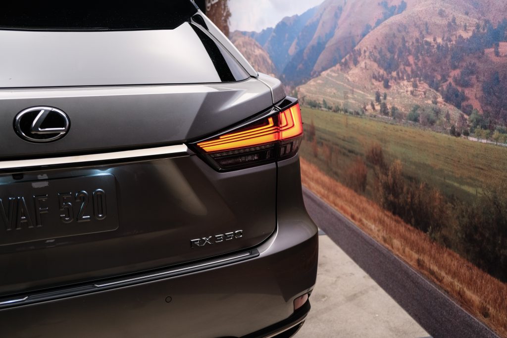
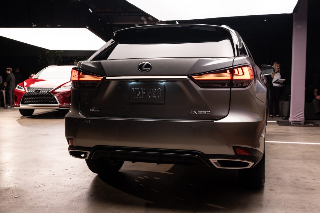
The new touchscreen may be the headliner, but it was not the sole change to the 2020 RX. The exterior adjustments are minor for the most part, comprising of a front-end alteration with two new spindle grilles and a rear refactoring that borders on imperceivable.
In truth, that was the extent of the changes necessary to modernize the RX — this is still an aggressively styled crossover that stands apart from the relatively safe designs of its competitors.
It was a curious move to borrow the front grille pattern of the UX for the standard RX, but the elaborate detail suits the larger front face and doesn’t look out of place.
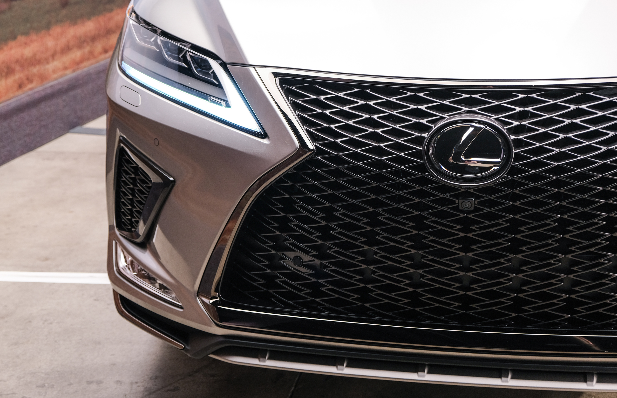
The same goes for the NX-inspired look of the RX F SPORT — in fact, the design elements that feel cluttered on the NX front-end have enough room to breathe with the extra space afforded by the RX’s size.
For the past decade, Lexus has been unapologetic in its commitment to a specific vision, whether it be Remote Touch or the spindle grille or pushing a design-first narrative for the brand. While it may be hyperbolic to suggest the inclusion of a touchscreen means Lexus is moving away from this vision, it’s safe to say the RX is the beginning of a sea change for the brand’s interior design.

Comments