Comments
Loving all the updates. I used to hate that space in the dashboard with the screen. And now it just looks pretty and clean. It kind reminding me of BMW somehow. But, in a more elegant way. Maybe it's time Lexus brings the RX F to compete against the X5M & GLE63s
I can't put my finger on it, but the exterior looks more like a minivan to me than it did before. It actually looks sort of like the Honda Odyssey in some way. Perhaps the smaller headlights, more sloping front end, swept back roofline, FWD proportions and massive overhangs?

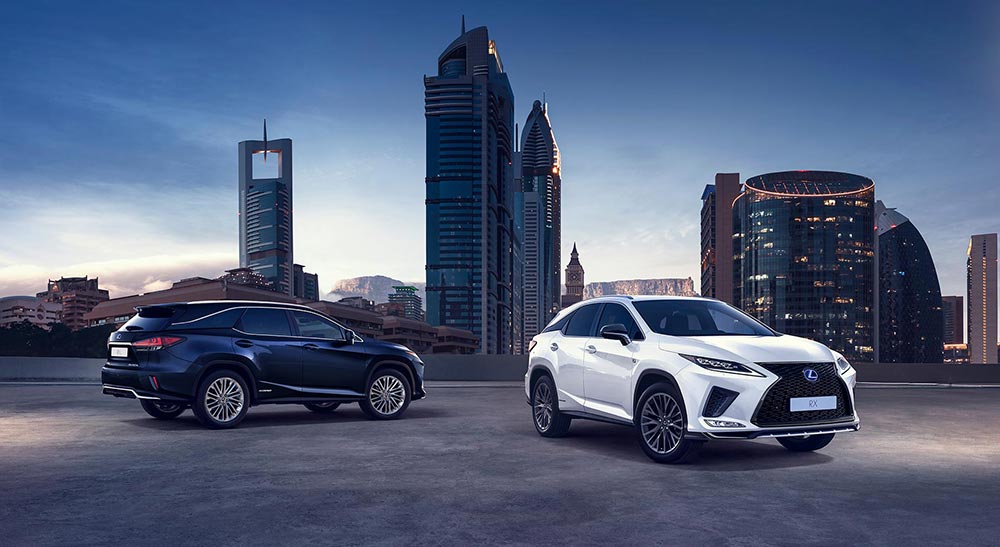
Overall, these updates are nice and help to clean up the design. Head on, the new front end looks more mature and appealing, and I like the new grill insert design. Between this and the UX, it certainly seems to be the grill design for Lexus SUVs. I guess we'll see on the 2020 GX soon?

TNGA RX can't come fast enough :)
R
  • R
    RAL
  • May 29, 2019
Gecko
I can't put my finger on it, but the exterior looks more like a minivan to me than it did before. It actually looks sort of like the Honda Odyssey in some way. Perhaps the sloping front end, swept back roofline, FWD proportions and massive overhangs?

Overall, these updates are nice and help to clean up the design.

TNGA RX can't come fast enough :)
I'm glad I am not the only one to see minivan phantoms from certain angles of the RXL.

Exterior design detail is more refined and less brash.

hmmm ... steering wheel stayed the same.
D
  • D
  • May 29, 2019
Updates look pretty good. Loving the mesh grilles for the non-FSport models that Lexus is doing now. I'm also glad they didn't slap a continuous taillight on it even though there was an article a while ago where Lexus said they were going to start following that trend.

But yes, like everyone else, I also see more minivan vibes in the RXL...
I really wish they refreshed the instrument cluster and steering wheel. It’s a shame that in 2020, we are still using Toyota’s cruise control stalk.
I know it's just a facelift, but sorry to say that this car won't hold a candle Infront of the current Highlander, let alone the newly one which is superior mechanically and design wise
i wonder if that touchscreen slides down when the vehicle is switched off? also is there a button when pressed makes the touchscreen slide up and down?
From what I can tell hood slope is exact same as on previous design but notion of bigger slope on the front end comes from the bottom spindle part which doesn't protrude at 90 degrees anymore, it's actually missing giant flat piece of surface on the side which helped the front not to look droopy (even LF-1 has that piece). It is now replaced by fake big vent. Second element that adds notion of a slope is removal of flat surface underneath headlights, that snow piling part. Very similar to what they did to RC refresh where headlights follow the body surface without any recess that's why new RC also looks more droopy that the original.

Touchscreen option is welcome addition but it's an instance where you have to sit and try, I can tell it won't be comfortable to reach but I don't think intention was to prioritize hand touch over touchpad. Glad they have touchpad this time instead of the analog stick. Only probable drawback is that screen is not further down the dash but form what I can tell not by much. Unfortunately that surface on top of the center stack that flows into instrument cluster hood is aesthetically ruined now because they put on a cap on top of it to close the hole.


Happy pixel hunting touchscreen lovers :D


Smart cellphone storage as well as wireless charging pad :thumbsup:
Horus468
I really wish they refreshed the instrument cluster and steering wheel. It’s a shame that in 2020, we are still using Toyota’s cruise control stalk.
Removing stalk is probably one of the worst ergonomic decisions they ever made.

Old stalk was very intuitive and easy to use, easier than buttons on steering wheel.

Plus new Toyotas get buttons on steering wheel too.
Update looks good overall, infotainment was a sore point with reviewers for a long time and now it looks that they covered literally every angle possible with touch, pad, huge screen, android, apple, Alexa... They now have everything.
a touchscreen with a touchpad,I may have to reconsider LM's screen control method,especially when alaphard has a touchscreen
Certainly seems like one of Lexus' more successful and thorough refreshes. The front end and taillight changes look better than the outgoing ones. I like that the suspension tweaks promise to improve the driving feel and reduce body roll. Fingerprints notwithstanding, I like the touchscreen functionality.

I need more clarity on the "2 new options for F Sport", though. Is AVS (Adaptive Variable Suspension) the other difference between the two? Or is it a "base" F Sport "look" with front & rear performance dampers, Drive Mode Select with Sport+ & Customer Drive Modes and then an upgraded F Sport package that adds AVS, cold air intake, active sound control, Electric Power Steering (EPS), and a heated steering wheel? And why mention the EPS as an upgrade? All RXs come with electric power steering. Did they mean to say firmer, retuned EPS?

And why is kick opening for the rear lift gate an option? it should definitely be standard on a luxury brand vehicle.
More info on euro newsroom:
https://newsroom.lexus.eu/new-lexus-rx-makes-world-debut/

Blade ahs seems interesting, first lexus with apple CarPlay in Europe, and first TMC vehicle with Android auto I think.

Infotainment in Europe for TMC is handled by different company and usually has different feature set.
spwolf
More info on euro newsroom:
https://newsroom.lexus.eu/new-lexus-rx-makes-world-debut/
And a bit more (and yet more images) on the Lexus Global Newsroom:
https://global.toyota/en/newsroom/lexus/28309969.html

One interesting detail: the 2-position 3rd-row seat for RX L is only available primarily in Japan and Europe. In North America and South Korea it's fixed in the forward position, while in China it's fixed in the rear position.

:mad: that BladeScan Type AHS headlights aren't legal in North America.
mediumhot
Touchscreen option is welcome addition but it's an instance where you have to sit and try, I can tell it won't be comfortable to reach but I don't think intention was to prioritize hand touch over touchpad. Glad they have touchpad this time instead of the analog stick. Only probable drawback is that screen is not further down the dash but form what I can tell not by much. Unfortunately that surface on top of the center stack that flows into instrument cluster hood is aesthetically ruined now because they put on a cap on top of it to close the hole.
My thoughts exactly. The added touchscreen function is OK and the screen moved forward, but just try to imagine in a current RX: there is no way that the screen can be close enough to get comfortable access to the touch function without a complete dash redesign. Also the extra surface material to close the gap ruins the premiumness. Good additions though are the smartphone holder and added usb ports (which now makes 6 in total!).
LEXUSQTR
i wonder if that touchscreen slides down when the vehicle is switched off? also is there a button when pressed makes the touchscreen slide up and down?
No, this new screen remains a fixed one, just like the old version.
They’re clearly addressing what’s wrong or at least people complains about. Even if they lock the touch input when driving it’s a clear upgrade.
In my opinion the general redesign is a success as the model doesn't need much more to face competition.
It keeps its original design (with all its pro's and con's) with a lot of personality. The engineers further improved suspension for comfort and multimedia is now finally up-to-date. They also listened to customers' input on the available interior colours: most combinations now have black lower interior panels. The Noble Brown lower interior panels are kept to a minimum (only combined with one lighter seat colour). The issue of the brown panels having a colour difference between the different surfaces is somehow restricted now.

The only 3 items that are a bit of a disappointment to me, are:
- the lack of a fully digital meter combo with personalization options like e.g. in recent Audi models: I suppose that this is kept for the new model in a few years
- PHEV version: I know that this is coming, but it should have been here now already
- improvement on material use (get rid of hard plastics) in the lower console and door panels: I am afraid that this is not going to happen any time soon, unfortunately...

And... another small item that I would have changed: to make a bit more family lookalike with the new UX the rear light units could have been linked with a red LED illuminated line instead of the current chrome line. That would have been a really cool feature, I think.


spwolf
Blade ahs seems interesting, first lexus with apple CarPlay in Europe, and first TMC vehicle with Android auto I think.
Here in US, Sequoia/Tacoma/4Runner/Tundra are first to have Android Auto, but RX may well be first TMC vehicle to have it in Europe.
I'm not a fan of touchscreens but hopefully this new generation will be more reliable than the previous versions. Apparently Lexus is going to start installing the touchscreen option in further refreshes. Glad to see you still have the option to use the remote.

At first I wasn't seeing the changes in the headlights and tail lights but I went out in our shop to see a previous year model and now I can see the changes more clearly.
I can't even tell how the front end has changed, but for some reason it looks better to me, and the rear taillight change is welcome, just because I'm getting sick of seeing so many identical RXs on the road.

The touchscreen is also a major step in the right direction, with the addition of Apple CarPlay and presumably also Android Auto.

also, at 0:24 in the video they used footage of the pre-facelift RX lol...
meth.ix
I can't even tell how the front end has changed, but for some reason it looks better to me, and the rear taillight change is welcome, just because I'm getting sick of seeing so many identical RXs on the road.

The touchscreen is also a major step in the right direction, with the addition of Apple CarPlay and presumably also Android Auto.

also, at 0:24 in the video they used footage of the pre-facelift RX lol...
The headlight became one slick shape at the front with nothing jutting out from the sides. Almost similar to the RC headlights. There also seems to be a fake side intakes next to the grille as well. The grille itself is also more refined, looking a lot less plastered on. I feel the next RX would nail the spindle design.
They finally added the Android Auto which was to happen years ago. I still remember their iconic (ironic) statement on not having Android Auto - 80% of our customers have Apple Device, but they didn't even add Carplay to all of their cars.
R
  • R
    RAL
  • May 30, 2019
LEXUSQTR
i wonder if that touchscreen slides down when the vehicle is switched off? also is there a button when pressed makes the touchscreen slide up and down?
Welcome! @LEXUSQTR
Good improvement to the frontal aspect not sure if it is lower ( the grille) however it looks lower and more an integral,part of the design. much better.
I agree with Joe and thought they they would have aped the rear view of the UX and put in the horizontal light feature which looks good on the UX.
Looks very good we can nitpick but overall this is a good looking vehicle and it is a Lexus!
The front end closely resembles the NX. The red NuLux F-Sport seats also look very similar to the NX version.

Touchscreen is great but the screen is too far away for it to be useful IMO.

R