Giant Cartoon Robots & Japanese Porches Inspired the Lexus UX Crossover Design


With every Lexus model, there are specific ideas and themes that help to shape the overall design. For the new UX crossover, two very different concepts influenced its appearance: an anime robot from the 1980s, and a Japanese-style house verdana called Engawa.

The cartoon robot Mazinger Z was a warning sign in the early design stages of the UX, as chief engineer Chika Kako did not want the crossover to resemble the anime legend — from Cool Hunting:

When Chika Kako, the first woman chief engineer at Lexus, saw designs for the brand’s all-new UX subcompact crossover, she thought of childhood days spent watching anime cartoons with her brother. The SUV’s rear lights reminded her of Mazinger Z, a hulking manga robot on the small screen in the late 70’s and early 80’s. It was a good look for an animated character, she thought, but not on the latest addition to the Lexus line-up.

“The original shape was really unnatural-looking,” Kako tells us via a translator at the vehicle’s global launch in Stockholm earlier this month. Once she told the all-male design team to soften the aggressive exterior, they got the message. “Simply by mentioning Mazinger, they understood what I meant.”

Engawa is essentially a porch that surrounds Japanese homes, extending the living space out into the world — from the Robb Report:

Because of the vehicle’s small size, [chief designer] Suga and Kako wanted to give the interior a greater sense of space. To achieve this, they drew inspiration from Japanese architecture. “We have this concept where you use the outside space as a continuation of your environment,” Suga says.

“Japanese houses are very small, but they have large windows, so the mountains and trees and nature outside are like a picture, an extension of your living space.” Kako adds, “One thing I asked for right away was this line that goes from the dashboard and continues to the outside of the fenders,” she says. The result was not only a sense of openness but also a commanding view of the road, despite the vehicle’s relatively low seating position and center of gravity (no top-heaviness here).

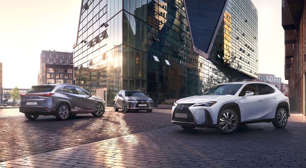
Lexus UX: First Generation
Comments
lol. Well looks like a very good update for CT. If you look at it that way then you wont have any complaints. I still want to see the car from the rear. Lexus knows there is nothing special in the front. Also i think the DRL is what was used on the refreshed CT. So, that could be a hint that this is replacing the CT.
Honestly, the front end of the car reminds me of this:

Honestly, the front end of the car reminds me of this:

Honestly, the front end of the car reminds me of this:

  • Joe
    Joe
  • February 27, 2018
For those who don't like the first looks on these pictures: bear in mind that almost every new Lexus doesn't look well on screen or paper (the LC was perhaps an exception, but then again we're talking sky high standards... ;))
The specific Lexus design with curves and edges is very difficult to grasp in a picture, whereas in reality most of their models show a whole other thing... White is not an easy 'colour' to communicate on picture, either.

Take the wheel arches, for example: they look rather similar to the UX Concept, luckily a bit downtuned. Also a nice detail is the visual continuation of the elevated side parts of the bonnet into the dashboard.
Combined with the original rear part with the horizontal continuous red line, I think the subtle original details of this car will surprise you positively when you see it in the flesh...

[​IMG]

[​IMG]
Rather different from what we were expecting, however looks neat and together just hope that will be enough.
Is this the replacement for the CT or is it an additional model in the line up?
Surely the new ES must launch anytime now? Interesting times ahead any ideas on what will happen to the Gas?
Rather different from what we were expecting, however looks neat and together just hope that will be enough.
Is this the replacement for the CT or is it an additional model in the line up?
Surely the new ES must launch anytime now? Interesting times ahead any ideas on what will happen to the Gas?
Rather different from what we were expecting, however looks neat and together just hope that will be enough.
Is this the replacement for the CT or is it an additional model in the line up?
Surely the new ES must launch anytime now? Interesting times ahead any ideas on what will happen to the Gas?
Joe
For those who don't like the first looks on these pictures: bear in mind that almost every new Lexus doesn't look well on screen or paper (the LC was perhaps an exception, but then again we're talking sky high standards... ;))
The specific Lexus design with curves and edges is very difficult to grasp in a picture, whereas in reality most of their models show a whole other thing... White is not an easy 'colour' to communicate on picture, either.

Take the wheel arches, for example: they look rather similar to the UX Concept, luckily a bit downtuned. Also a nice detail is the visual continuation of the elevated side parts of the bonnet into the dashboard.
Combined with the original rear part with the horizontal continuous red line, I think the subtle original details of this car will surprise you positively when you see it in the flesh...

[​IMG]

[​IMG]
Well said you are correct in your assessment of the style.
Interrupted shoulder line on a vehicle with premium badge. I'm all for design hocus pocus but concept has an angry and firm stance because front fender sharp shoulder line flows along the profile. FWD Lexus just can't stay away from Toyota graphics apparently and the usual placement of handles right across the sheet metal tension.
Unfortunately, my worries so far haven't ceased. It looks great against budget cars. But, I think it steers away from the design direction that Lexus had seemed to follow lately.

It is quite possible that fwd will face internal competition from CHR hsd 4wd.

Edit : I will eat my hat for my criticism. The UX is more impressive and beautiful than CHR
! I was just too enthusiastic about the concept.
In this class of premium vehicles, I fully expect the UX to be a competitive and strong seller.
Very disappointing but I didn't expect much as the concept as an absolute mess to begin with so I could never imagine a production version. It just looks so underwhelming. I hate the headlights, they look like the latest Alfa Romeo SUV.

Very disappointing but I didn't expect much as the concept as an absolute mess to begin with so I could never imagine a production version. It just looks so underwhelming. I hate the headlights, they look like the latest Alfa Romeo SUV.

Very disappointing but I didn't expect much as the concept as an absolute mess to begin with so I could never imagine a production version. It just looks so underwhelming. I hate the headlights, they look like the latest Alfa Romeo SUV.

Joe
For those who don't like the first looks on these pictures: bear in mind that almost every new Lexus doesn't look well on screen or paper (the LC was perhaps an exception, but then again we're talking sky high standards... ;))
The specific Lexus design with curves and edges is very difficult to grasp in a picture, whereas in reality most of their models show a whole other thing... White is not an easy 'colour' to communicate on picture, either.

Take the wheel arches, for example: they look rather similar to the UX Concept, luckily a bit downtuned. Also a nice detail is the visual continuation of the elevated side parts of the bonnet into the dashboard.
Combined with the original rear part with the horizontal continuous red line, I think the subtle original details of this car will surprise you positively when you see it in the flesh...

[​IMG]

[​IMG]

You're right, Lexus and photography is usually not a successful marriage.
And maybe is the white color not the best choice here, but why do they choose this?
Choosing a white color was hot, 5 years ago or so.

Was this car launched 2-3 years ago, then I was an enthusiastic. Now a little less, I expected more especially with the concept in mind.
I miss the WOW-factor here, and was not that promised to us, more emotion at Lexus?
It started well with the concept, perhaps a bit exaggerated on the other side, but that's allowed for a concept.

If we look around us once, especially in Europe, then we see a lot of those little-big ones.
Whether Lexus can still leave his mark here, I doubt it. Very late in the market and they do not jump out.
And they will not be cheap either. But certainly a good successor to the CT, is that the intention ?

O