Video: Quick Tour of the Lexus UX Subcompact Crossover


With such a long wait between reveal and availability, the new Lexus UX subcompact crossover is not exactly top of mind. This makes Lexus Canada’s refresher video a nice reminder of what’s yet to come:

(The new ES had yet to be announced when the UX was revealed, and the similarities between the interiors are pronounced. Have to think this is Lexus locking down a common cabin design for models below the flagship level.)

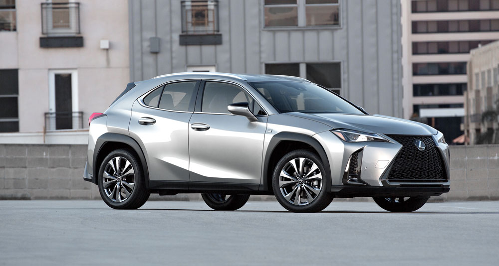
Lexus UX: First Generation
Comments
  • Joe
    Joe
  • February 27, 2018
For those who don't like the first looks on these pictures: bear in mind that almost every new Lexus doesn't look well on screen or paper (the LC was perhaps an exception, but then again we're talking sky high standards... ;))
The specific Lexus design with curves and edges is very difficult to grasp in a picture, whereas in reality most of their models show a whole other thing... White is not an easy 'colour' to communicate on picture, either.

Take the wheel arches, for example: they look rather similar to the UX Concept, luckily a bit downtuned. Also a nice detail is the visual continuation of the elevated side parts of the bonnet into the dashboard.
Combined with the original rear part with the horizontal continuous red line, I think the subtle original details of this car will surprise you positively when you see it in the flesh...

[​IMG]

[​IMG]
Rather different from what we were expecting, however looks neat and together just hope that will be enough.
Is this the replacement for the CT or is it an additional model in the line up?
Surely the new ES must launch anytime now? Interesting times ahead any ideas on what will happen to the Gas?
Rather different from what we were expecting, however looks neat and together just hope that will be enough.
Is this the replacement for the CT or is it an additional model in the line up?
Surely the new ES must launch anytime now? Interesting times ahead any ideas on what will happen to the Gas?
Rather different from what we were expecting, however looks neat and together just hope that will be enough.
Is this the replacement for the CT or is it an additional model in the line up?
Surely the new ES must launch anytime now? Interesting times ahead any ideas on what will happen to the Gas?
Joe
For those who don't like the first looks on these pictures: bear in mind that almost every new Lexus doesn't look well on screen or paper (the LC was perhaps an exception, but then again we're talking sky high standards... ;))
The specific Lexus design with curves and edges is very difficult to grasp in a picture, whereas in reality most of their models show a whole other thing... White is not an easy 'colour' to communicate on picture, either.

Take the wheel arches, for example: they look rather similar to the UX Concept, luckily a bit downtuned. Also a nice detail is the visual continuation of the elevated side parts of the bonnet into the dashboard.
Combined with the original rear part with the horizontal continuous red line, I think the subtle original details of this car will surprise you positively when you see it in the flesh...

[​IMG]

[​IMG]
Well said you are correct in your assessment of the style.
Interrupted shoulder line on a vehicle with premium badge. I'm all for design hocus pocus but concept has an angry and firm stance because front fender sharp shoulder line flows along the profile. FWD Lexus just can't stay away from Toyota graphics apparently and the usual placement of handles right across the sheet metal tension.
Unfortunately, my worries so far haven't ceased. It looks great against budget cars. But, I think it steers away from the design direction that Lexus had seemed to follow lately.

It is quite possible that fwd will face internal competition from CHR hsd 4wd.

Edit : I will eat my hat for my criticism. The UX is more impressive and beautiful than CHR
! I was just too enthusiastic about the concept.
In this class of premium vehicles, I fully expect the UX to be a competitive and strong seller.
Very disappointing but I didn't expect much as the concept as an absolute mess to begin with so I could never imagine a production version. It just looks so underwhelming. I hate the headlights, they look like the latest Alfa Romeo SUV.

Very disappointing but I didn't expect much as the concept as an absolute mess to begin with so I could never imagine a production version. It just looks so underwhelming. I hate the headlights, they look like the latest Alfa Romeo SUV.

Very disappointing but I didn't expect much as the concept as an absolute mess to begin with so I could never imagine a production version. It just looks so underwhelming. I hate the headlights, they look like the latest Alfa Romeo SUV.

Joe
For those who don't like the first looks on these pictures: bear in mind that almost every new Lexus doesn't look well on screen or paper (the LC was perhaps an exception, but then again we're talking sky high standards... ;))
The specific Lexus design with curves and edges is very difficult to grasp in a picture, whereas in reality most of their models show a whole other thing... White is not an easy 'colour' to communicate on picture, either.

Take the wheel arches, for example: they look rather similar to the UX Concept, luckily a bit downtuned. Also a nice detail is the visual continuation of the elevated side parts of the bonnet into the dashboard.
Combined with the original rear part with the horizontal continuous red line, I think the subtle original details of this car will surprise you positively when you see it in the flesh...

[​IMG]

[​IMG]

You're right, Lexus and photography is usually not a successful marriage.
And maybe is the white color not the best choice here, but why do they choose this?
Choosing a white color was hot, 5 years ago or so.

Was this car launched 2-3 years ago, then I was an enthusiastic. Now a little less, I expected more especially with the concept in mind.
I miss the WOW-factor here, and was not that promised to us, more emotion at Lexus?
It started well with the concept, perhaps a bit exaggerated on the other side, but that's allowed for a concept.

If we look around us once, especially in Europe, then we see a lot of those little-big ones.
Whether Lexus can still leave his mark here, I doubt it. Very late in the market and they do not jump out.
And they will not be cheap either. But certainly a good successor to the CT, is that the intention ?
Joaquin Ruhi
On a separate note, the Lexus Europe official news release adds a significant detail missing from its U.S. counterpart Mikeavelli linked to a few posts above: the UX's Chief Engineer is none other than Chika Kako, newly-minted Lexus International vice president, the highest-ranked woman in Toyota's corporate hierarchy and chief engineer for Lexus CT's first and second refresh.
VERY significant detail. Pretty amazing that the chief engineer for the UX is also the second-ranked executive for Lexus.

Gecko
Regardless of what any of us say or think, they're about to sell so many of these it'll be stupid. Probably instantly Lexus third best selling model behind RX and NX.
If it wasn't for the new RXL, I could see this passing the RX worldwide.

Andyl
One thing that is puzzling to me. There are two versions of the front fenders. One has smoother and the other one has a squared shaped besides the headlight. Maybe for different markets?
Honestly, I believe this is just the lighting on the photos vs. video.
Yikes. While I like the interior, the exterior leaves much to be desired.

T