Comments
Interesting.

A few random thoughts:
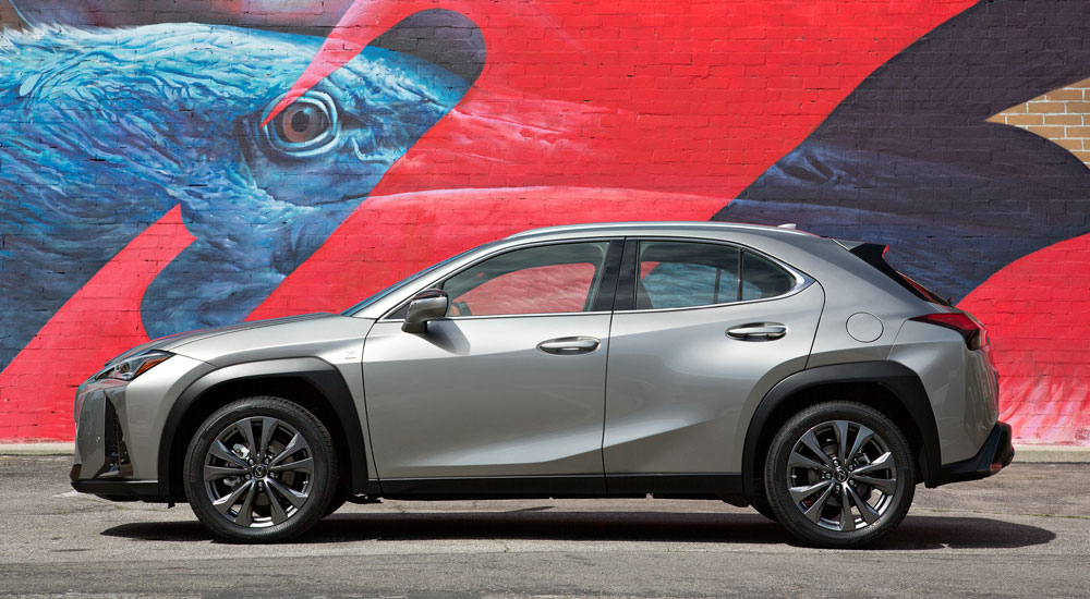
  • This is quite a subdued departure from the UX concept, which is shocking considering that the LC/LF-LC, LS/LF-FC and NX/LF-NX were all much truer to their concepts. At the same time, I've been looking for Lexus designs to mature a bit and this seems toned down and more mainstream... I'm just not sure if it's in a good way.
  • Exterior is probably my least favorite recent Lexus debut. I think part of the challenge is that so many of Lexus signature design cues - spindle grille, aggressive side sculpting, tripe LEDs with LED check mark DRL - are probably hard to integrate on a car that's only slightly larger than a kitchen table. However, the front end looks sort of flat but disproportionate - but that might just be the angle. Even if you pause the video at 0:09, the front end just looks... not elegant? which is a let down following up on LS and LC. I'm ready to see a smaller, tighter, neater spindle and this is not it. The huge spindle flanked by two huge black vertical slits on either side looks sort of fish or insect-esque, to me. There needs to be more "body" and less openings, IMO.
  • I am curious if the front grille mesh will be different for the non F-Sport version. I hope so. The standard LS mesh grille adds a lot of dimension to the front of the car that the F Sport grille takes away - too flat and generic looking, IMO.
  • I think the interior looks quite nice. The layout is rather basic, but from the photos, everything looks thoughtfully designed and well executed.
  • It's shocking to me that what is Lexus' most entry-level product will have the same steering wheel as the LS 500. At the launch of the LS, I wished it had a more distinct steering wheel (with more wood), something like the refreshed 4LS that had exposed wood all along the bottom portion. I don't like the LS's full leather rim with wood inlays, and the steering wheel in this car - which will cost about 1/3 as much - is basically the same one.
  • Regardless of what any of us say or think, they're about to sell so many of these it'll be stupid. Probably instantly Lexus third best selling model behind RX and NX.
The most important question is. Does it come in AWD?
To me, the UX looks great both exterior and interior. The front borrows some cues from NX, RX and the facelifted IS. In fact it looks like a raised IS or a lowered NX. Upon a closer look at the front, I like the treatment of the new headlights - they integrate the L- shaped DRL back into the same housing. This is a welcome change particularly if you do hand wash with the car. I always need to use a air blower to blow out the remaining water droplets from the DRL of our IS and NX.

And because of the lack of distinct L- shaped DRL, they can conceal the headlamp washers normally in a lid flushed with the bumper.

The interior looks seamless and layout is logical. Looks like a good quality interior in this price range. The revised shift knob seems to look great from the blurred picture.

One thing that is puzzling to me. There are two versions of the front fenders. One has smoother and the other one has a squared shaped besides the headlight. Maybe for different markets?
lol. Well looks like a very good update for CT. If you look at it that way then you wont have any complaints. I still want to see the car from the rear. Lexus knows there is nothing special in the front. Also i think the DRL is what was used on the refreshed CT. So, that could be a hint that this is replacing the CT.
Honestly, the front end of the car reminds me of this:

Honestly, the front end of the car reminds me of this:

Honestly, the front end of the car reminds me of this:

Honestly, the front end of the car reminds me of this:

  • Joe
    Joe
  • February 27, 2018
For those who don't like the first looks on these pictures: bear in mind that almost every new Lexus doesn't look well on screen or paper (the LC was perhaps an exception, but then again we're talking sky high standards... ;))
The specific Lexus design with curves and edges is very difficult to grasp in a picture, whereas in reality most of their models show a whole other thing... White is not an easy 'colour' to communicate on picture, either.

Take the wheel arches, for example: they look rather similar to the UX Concept, luckily a bit downtuned. Also a nice detail is the visual continuation of the elevated side parts of the bonnet into the dashboard.
Combined with the original rear part with the horizontal continuous red line, I think the subtle original details of this car will surprise you positively when you see it in the flesh...

[​IMG]

[​IMG]
Rather different from what we were expecting, however looks neat and together just hope that will be enough.
Is this the replacement for the CT or is it an additional model in the line up?
Surely the new ES must launch anytime now? Interesting times ahead any ideas on what will happen to the Gas?
Rather different from what we were expecting, however looks neat and together just hope that will be enough.
Is this the replacement for the CT or is it an additional model in the line up?
Surely the new ES must launch anytime now? Interesting times ahead any ideas on what will happen to the Gas?
Rather different from what we were expecting, however looks neat and together just hope that will be enough.
Is this the replacement for the CT or is it an additional model in the line up?
Surely the new ES must launch anytime now? Interesting times ahead any ideas on what will happen to the Gas?
Rather different from what we were expecting, however looks neat and together just hope that will be enough.
Is this the replacement for the CT or is it an additional model in the line up?
Surely the new ES must launch anytime now? Interesting times ahead any ideas on what will happen to the Gas?
Joe
For those who don't like the first looks on these pictures: bear in mind that almost every new Lexus doesn't look well on screen or paper (the LC was perhaps an exception, but then again we're talking sky high standards... ;))
The specific Lexus design with curves and edges is very difficult to grasp in a picture, whereas in reality most of their models show a whole other thing... White is not an easy 'colour' to communicate on picture, either.

Take the wheel arches, for example: they look rather similar to the UX Concept, luckily a bit downtuned. Also a nice detail is the visual continuation of the elevated side parts of the bonnet into the dashboard.
Combined with the original rear part with the horizontal continuous red line, I think the subtle original details of this car will surprise you positively when you see it in the flesh...

[​IMG]

[​IMG]
Well said you are correct in your assessment of the style.

R