Lexus UX to Debut Tomorrow at Geneva Motor Show


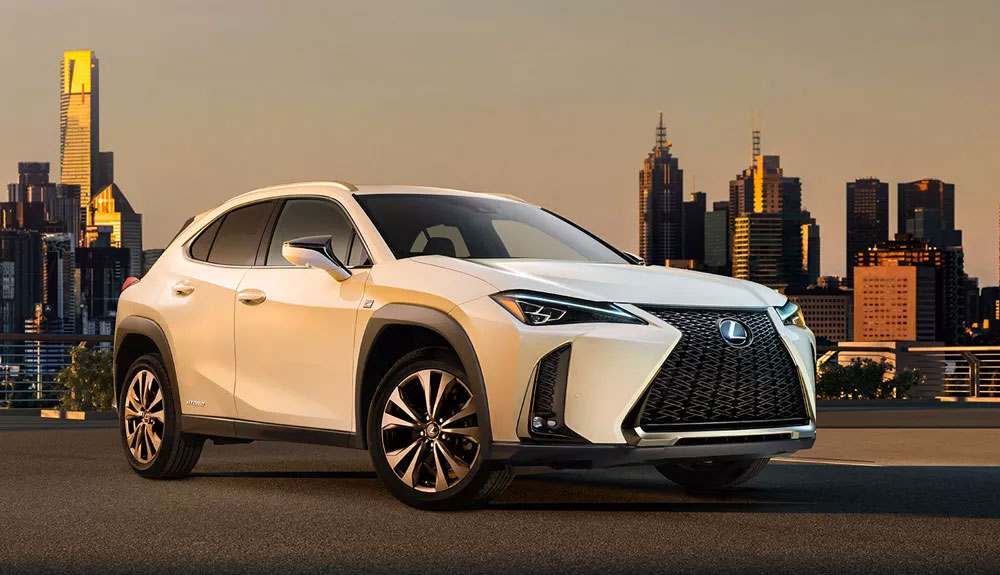
Tomorrow morning, Lexus will debut the new UX subcompact crossover at the Geneva Motor Show. The press conference will be livestreamed at 10am CET, or 4:00am ET/1:00am PT in North America:

(As a big fan of the subcompact crossover genre, I’m excited about the new UX — early impressions would be that the design is subdued, but in line with the NX & RX. Looking forward to seeing the interior details.)

AutoshowsLexus UX: First Generation
Comments
To me, the UX looks great both exterior and interior. The front borrows some cues from NX, RX and the facelifted IS. In fact it looks like a raised IS or a lowered NX. Upon a closer look at the front, I like the treatment of the new headlights - they integrate the L- shaped DRL back into the same housing. This is a welcome change particularly if you do hand wash with the car. I always need to use a air blower to blow out the remaining water droplets from the DRL of our IS and NX.

And because of the lack of distinct L- shaped DRL, they can conceal the headlamp washers normally in a lid flushed with the bumper.

The interior looks seamless and layout is logical. Looks like a good quality interior in this price range. The revised shift knob seems to look great from the blurred picture.

One thing that is puzzling to me. There are two versions of the front fenders. One has smoother and the other one has a squared shaped besides the headlight. Maybe for different markets?
lol. Well looks like a very good update for CT. If you look at it that way then you wont have any complaints. I still want to see the car from the rear. Lexus knows there is nothing special in the front. Also i think the DRL is what was used on the refreshed CT. So, that could be a hint that this is replacing the CT.
Honestly, the front end of the car reminds me of this:

Honestly, the front end of the car reminds me of this:

Honestly, the front end of the car reminds me of this:

  • Joe
    Joe
  • February 27, 2018
For those who don't like the first looks on these pictures: bear in mind that almost every new Lexus doesn't look well on screen or paper (the LC was perhaps an exception, but then again we're talking sky high standards... ;))
The specific Lexus design with curves and edges is very difficult to grasp in a picture, whereas in reality most of their models show a whole other thing... White is not an easy 'colour' to communicate on picture, either.

Take the wheel arches, for example: they look rather similar to the UX Concept, luckily a bit downtuned. Also a nice detail is the visual continuation of the elevated side parts of the bonnet into the dashboard.
Combined with the original rear part with the horizontal continuous red line, I think the subtle original details of this car will surprise you positively when you see it in the flesh...

[​IMG]

[​IMG]
Rather different from what we were expecting, however looks neat and together just hope that will be enough.
Is this the replacement for the CT or is it an additional model in the line up?
Surely the new ES must launch anytime now? Interesting times ahead any ideas on what will happen to the Gas?
Rather different from what we were expecting, however looks neat and together just hope that will be enough.
Is this the replacement for the CT or is it an additional model in the line up?
Surely the new ES must launch anytime now? Interesting times ahead any ideas on what will happen to the Gas?
Rather different from what we were expecting, however looks neat and together just hope that will be enough.
Is this the replacement for the CT or is it an additional model in the line up?
Surely the new ES must launch anytime now? Interesting times ahead any ideas on what will happen to the Gas?
Joe
For those who don't like the first looks on these pictures: bear in mind that almost every new Lexus doesn't look well on screen or paper (the LC was perhaps an exception, but then again we're talking sky high standards... ;))
The specific Lexus design with curves and edges is very difficult to grasp in a picture, whereas in reality most of their models show a whole other thing... White is not an easy 'colour' to communicate on picture, either.

Take the wheel arches, for example: they look rather similar to the UX Concept, luckily a bit downtuned. Also a nice detail is the visual continuation of the elevated side parts of the bonnet into the dashboard.
Combined with the original rear part with the horizontal continuous red line, I think the subtle original details of this car will surprise you positively when you see it in the flesh...

[​IMG]

[​IMG]
Well said you are correct in your assessment of the style.
Interrupted shoulder line on a vehicle with premium badge. I'm all for design hocus pocus but concept has an angry and firm stance because front fender sharp shoulder line flows along the profile. FWD Lexus just can't stay away from Toyota graphics apparently and the usual placement of handles right across the sheet metal tension.
Unfortunately, my worries so far haven't ceased. It looks great against budget cars. But, I think it steers away from the design direction that Lexus had seemed to follow lately.

It is quite possible that fwd will face internal competition from CHR hsd 4wd.

Edit : I will eat my hat for my criticism. The UX is more impressive and beautiful than CHR
! I was just too enthusiastic about the concept.
In this class of premium vehicles, I fully expect the UX to be a competitive and strong seller.
Very disappointing but I didn't expect much as the concept as an absolute mess to begin with so I could never imagine a production version. It just looks so underwhelming. I hate the headlights, they look like the latest Alfa Romeo SUV.

Very disappointing but I didn't expect much as the concept as an absolute mess to begin with so I could never imagine a production version. It just looks so underwhelming. I hate the headlights, they look like the latest Alfa Romeo SUV.

Very disappointing but I didn't expect much as the concept as an absolute mess to begin with so I could never imagine a production version. It just looks so underwhelming. I hate the headlights, they look like the latest Alfa Romeo SUV.

Joe
For those who don't like the first looks on these pictures: bear in mind that almost every new Lexus doesn't look well on screen or paper (the LC was perhaps an exception, but then again we're talking sky high standards... ;))
The specific Lexus design with curves and edges is very difficult to grasp in a picture, whereas in reality most of their models show a whole other thing... White is not an easy 'colour' to communicate on picture, either.

Take the wheel arches, for example: they look rather similar to the UX Concept, luckily a bit downtuned. Also a nice detail is the visual continuation of the elevated side parts of the bonnet into the dashboard.
Combined with the original rear part with the horizontal continuous red line, I think the subtle original details of this car will surprise you positively when you see it in the flesh...

[​IMG]

[​IMG]

You're right, Lexus and photography is usually not a successful marriage.
And maybe is the white color not the best choice here, but why do they choose this?
Choosing a white color was hot, 5 years ago or so.

Was this car launched 2-3 years ago, then I was an enthusiastic. Now a little less, I expected more especially with the concept in mind.
I miss the WOW-factor here, and was not that promised to us, more emotion at Lexus?
It started well with the concept, perhaps a bit exaggerated on the other side, but that's allowed for a concept.

If we look around us once, especially in Europe, then we see a lot of those little-big ones.
Whether Lexus can still leave his mark here, I doubt it. Very late in the market and they do not jump out.
And they will not be cheap either. But certainly a good successor to the CT, is that the intention ?

O