Lexus UX Subcompact Crossover Confirmed for Geneva Motor Show


Lexus have announced the long-awaited UX subcompact crossover will debut at the Geneva Motor Show on March 6th — here’s a short teaser video:

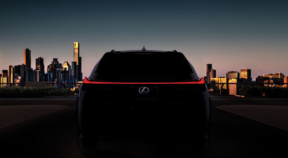
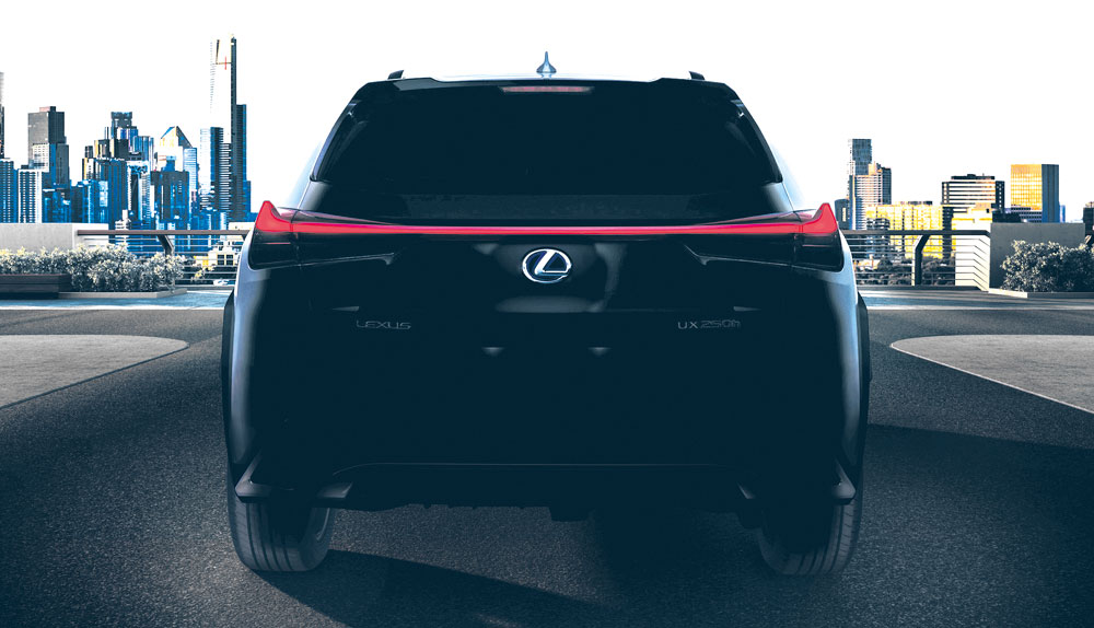
There is little detail in the press release beyond confirmation of the UX name, but crank up the brightness on the teaser image and there’s plenty to discuss (click for high-resolution):

“Lexus

Here we get a general idea of the shape, and the similarities between the UX and the LF-1 Limitless concept are undeniable. Both have the three-dimensional rear light bar that breaks away from the body, both have the same slope in the roof.

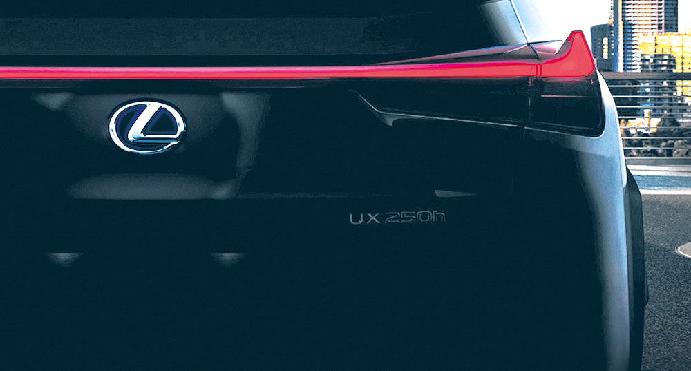
Zoom in closer, and the powertrain is revealed:
“Lexus

Here we have it — the UX will be offered with a 250h hybrid engine, an all-together new engine and designation for the Lexus lineup. This nameplate was trademarked two years ago and doesn’t come as a surprise, but it’s exciting nonetheless.

There we have it, the first teaser of the UX subcompact crossover — what do you think?

ConceptsFeatures
Comments
ct200e
I agree BMW X1 is uglier than UX but that does not mean that UX is a good looking car for 2018.


This is Jaguar i-Pace interior that is going into production the same year as Lexus UX. Not a concept, nor a chinese "futuristic" interior. This is 2018 Lexus!

Actually that Lexus interior looks better than Jags, even if Jags price is 2.5x more. You can actually brighten up the image to see more there.
OlFius
Did we have to wait so long for this? Boring, and I think we see here a F Sport version ?
Even the C-HR looks sexier...
it is F-Sport for sure, it has big lcd inside instead of the combo meters, like in LS. Heck might be same as in LS.

Lets hope shoulder lines stand out a lot more in real life than in this image... looks like they might.
Lexus UX Subcompact Crossover Revealed!

[​IMG]

A photo of the exterior and a video of the interior.
View the original article post
My first impression is of an NX minus the separate rear quarter side window behind the rear doors. I expected something more radically sculptured, although, as some of you have noted, perhaps Ultra White isn't the best color to bring out the side sculpturing. I do like this particular F Sport grille mesh pattern (click on the photo above to enlarge it and better appreciate this detail.

On a separate note, the Lexus Europe official news release adds a significant detail missing from its U.S. counterpart Mikeavelli linked to a few posts above: the UX's Chief Engineer is none other than Chika Kako, newly-minted Lexus International vice president, the highest-ranked woman in Toyota's corporate hierarchy and chief engineer for Lexus CT's first and second refresh.
I think it is cute, but I'm not feeling the eyebrow DRL.
Not a fan of the exterior. It looks somehow disproportionate, especially the profile. Rear quarter looks awkward with the wheel arch and the plastic cladding. I definitely prefer the X1 looks-wise.
ct200e
When i first saw the 250h logo , i thought (as i've already wrote) that i am living 2011 all over again. Now i am sure...My time machine works!

At least they will offer an EV option...
Wake me up when BMW develops a proper hybrid system that can do load shifting so the car won't go trash MPG mode when the battery runs out.
Interesting.

A few random thoughts:
  • This is quite a subdued departure from the UX concept, which is shocking considering that the LC/LF-LC, LS/LF-FC and NX/LF-NX were all much truer to their concepts. At the same time, I've been looking for Lexus designs to mature a bit and this seems toned down and more mainstream... I'm just not sure if it's in a good way.
  • Exterior is probably my least favorite recent Lexus debut. I think part of the challenge is that so many of Lexus signature design cues - spindle grille, aggressive side sculpting, tripe LEDs with LED check mark DRL - are probably hard to integrate on a car that's only slightly larger than a kitchen table. However, the front end looks sort of flat but disproportionate - but that might just be the angle. Even if you pause the video at 0:09, the front end just looks... not elegant? which is a let down following up on LS and LC. I'm ready to see a smaller, tighter, neater spindle and this is not it. The huge spindle flanked by two huge black vertical slits on either side looks sort of fish or insect-esque, to me. There needs to be more "body" and less openings, IMO.
  • I am curious if the front grille mesh will be different for the non F-Sport version. I hope so. The standard LS mesh grille adds a lot of dimension to the front of the car that the F Sport grille takes away - too flat and generic looking, IMO.
  • I think the interior looks quite nice. The layout is rather basic, but from the photos, everything looks thoughtfully designed and well executed.
  • It's shocking to me that what is Lexus' most entry-level product will have the same steering wheel as the LS 500. At the launch of the LS, I wished it had a more distinct steering wheel (with more wood), something like the refreshed 4LS that had exposed wood all along the bottom portion. I don't like the LS's full leather rim with wood inlays, and the steering wheel in this car - which will cost about 1/3 as much - is basically the same one.
  • Regardless of what any of us say or think, they're about to sell so many of these it'll be stupid. Probably instantly Lexus third best selling model behind RX and NX.
The most important question is. Does it come in AWD?
To me, the UX looks great both exterior and interior. The front borrows some cues from NX, RX and the facelifted IS. In fact it looks like a raised IS or a lowered NX. Upon a closer look at the front, I like the treatment of the new headlights - they integrate the L- shaped DRL back into the same housing. This is a welcome change particularly if you do hand wash with the car. I always need to use a air blower to blow out the remaining water droplets from the DRL of our IS nd NX.

And because of the lack of distinct L- shaped DRL, they can conceal the headlamp washers normally in a lid flushed with the bumper.

The interior looks seamless and layout is logical. Looks like a good quality interior in this price range. The revised shift knob seems to look great from the blurred picture.

One thing that is puzzling to me. There are two versions of the front fenders. One has smoother and the other one has a squared shaped besides the headlight. Maybe for different markets?
lol. Well looks like a very good update for CT. If you look at it that way then you wont have any complaints. I still want to see the car from the rear. Lexus knows there is nothing special in the front. Also i think the DRL is what was used on the refreshed CT. So, that could be a hint that this is replacing the CT.
Honestly, the front end of the car reminds me of this:

  • Joe
    Joe
  • February 27, 2018
For those who don't like the first looks on these pictures: bear in mind that almost every new Lexus doesn't look well on screen or paper (the LC was perhaps an exception, but then again we're talking sky high standards... ;))
The specific Lexus design with curves and edges is very difficult to grasp in a picture, whereas in reality most of their models show a whole other thing... White is not an easy 'colour' to communicate on picture, either.

Take the wheel arches, for example: they look rather similar to the UX Concept, luckily a bit downtuned. Also a nice detail is the visual continuation of the elevated side parts of the bonnet into the dashboard.
Combined with the original rear part with the horizontal continuous red line, I think the subtle original details of this car will surprise you positively when you see it in the flesh...

[​IMG]

[​IMG]
Rather different from what we were expecting, however looks neat and together just hope that will be enough.
Is this the replacement for the CT or is it an additional model in the line up?
Surely the new ES must launch anytime now? Interesting times ahead any ideas on what will happen to the Gas?
Joe
For those who don't like the first looks on these pictures: bear in mind that almost every new Lexus doesn't look well on screen or paper (the LC was perhaps an exception, but then again we're talking sky high standards... ;))
The specific Lexus design with curves and edges is very difficult to grasp in a picture, whereas in reality most of their models show a whole other thing... White is not an easy 'colour' to communicate on picture, either.

Take the wheel arches, for example: they look rather similar to the UX Concept, luckily a bit downtuned. Also a nice detail is the visual continuation of the elevated side parts of the bonnet into the dashboard.
Combined with the original rear part with the horizontal continuous red line, I think the subtle original details of this car will surprise you positively when you see it in the flesh...

[​IMG]

[​IMG]
Well said you are correct in your assessment of the style.
Interrupted shoulder line on a vehicle with premium badge. I'm all for design hocus pocus but concept has an angry and firm stance because front fender sharp shoulder line flows along the profile. FWD Lexus just can't stay away from Toyota graphics apparently and the usual placement of handles right across the sheet metal tension.
Unfortunately, my worries so far haven't ceased. It looks great against budget cars. But, I think it damages the luxury image direction that Lexus seemed to follow lately.

It is quite possible that fwd will face internal competition from CHR hsd 4wd.
In this class of premium vehicles, I fully expect the UX to be a competitive and strong seller.
Very disappointing but I didn't expect much as the concept as an absolute mess to begin with so I could never imagine a production version. It just looks so underwhelming. I hate the headlights, they look like the latest Alfa Romeo SUV.

Joe
For those who don't like the first looks on these pictures: bear in mind that almost every new Lexus doesn't look well on screen or paper (the LC was perhaps an exception, but then again we're talking sky high standards... ;))
The specific Lexus design with curves and edges is very difficult to grasp in a picture, whereas in reality most of their models show a whole other thing... White is not an easy 'colour' to communicate on picture, either.

Take the wheel arches, for example: they look rather similar to the UX Concept, luckily a bit downtuned. Also a nice detail is the visual continuation of the elevated side parts of the bonnet into the dashboard.
Combined with the original rear part with the horizontal continuous red line, I think the subtle original details of this car will surprise you positively when you see it in the flesh...

[​IMG]

[​IMG]

You're right, Lexus and photography is usually not a successful marriage.
And maybe is the white color not the best choice here, but why do they choose this?
Choosing a white color was hot, 5 years ago or so.

Was this car launched 2-3 years ago, then I was an enthusiastic. Now a little less, I expected more especially with the concept in mind.
I miss the WOW-factor here, and was not that promised to us, more emotion at Lexus?
It started well with the concept, perhaps a bit exaggerated on the other side, but that's allowed for a concept.

If we look around us once, especially in Europe, then we see a lot of those little-big ones.
Whether Lexus can still leave his mark here, I doubt it. Very late in the market and they do not jump out.
And they will not be cheap either. But certainly a good successor to the CT, is that the intention ?
Joaquin Ruhi
On a separate note, the Lexus Europe official news release adds a significant detail missing from its U.S. counterpart Mikeavelli linked to a few posts above: the UX's Chief Engineer is none other than Chika Kako, newly-minted Lexus International vice president, the highest-ranked woman in Toyota's corporate hierarchy and chief engineer for Lexus CT's first and second refresh.
VERY significant detail. Pretty amazing that the chief engineer for the UX is also the second-ranked executive for Lexus.

Gecko
Regardless of what any of us say or think, they're about to sell so many of these it'll be stupid. Probably instantly Lexus third best selling model behind RX and NX.
If it wasn't for the new RXL, I could see this passing the RX worldwide.

Andyl
One thing that is puzzling to me. There are two versions of the front fenders. One has smoother and the other one has a squared shaped besides the headlight. Maybe for different markets?
Honestly, I believe this is just the lighting on the photos vs. video.
Yikes. While I like the interior, the exterior leaves much to be desired.
Dreski
The most important question is. Does it come in AWD?
well considering tech reveal that most likely featured UX tech, yes.. E-Four for hybrid and Dynamic Torque Vectoring AWD for the Petrol. Look at the top of this page for info.
krew
If it wasn't for the new RXL, I could see this passing the RX worldwide.
It wont outsell NX everywhere... NX has cool situation where it sells well EVERYWHERE.

For instance, UX might outsell it in Europe and even in Japan, but then in US it wont get more than 50% of NX sales and likely the same goes for China where they prefer larger vehicles too. Same goes for Russia.
The problem of making the LC look so gorgeous. Everything else looks so bland...
I'm afraid Lexus is playing it too safe with the UX. I see where they are coming from. The competitors (BMW, MB, Audi, Volvo, Alfa Romeo, etc.) all have similar conservative mini crossovers that don't stand out, but sell like crazy due to the low entry price. And when I say low entry price, I'm not kidding: The new Audi Q2 costs $20.000 less than an entry level CT200h in Denmark (I'm comparing with the price when Lexus sold cars in Denmark...)

I would have preferred that Lexus repeated the formula of the NX and RX and made a car that really stood out in the sea of beige German competitors. I hope the eyebrow DRL works better here than on the CT refresh, and that it has a rump to die for.
LDeleuran
I'm afraid Lexus is playing it too safe with the UX. I see where they are coming from. The competitors (BMW, MB, Audi, Volvo, Alfa Romeo, etc.) all have similar conservative mini crossovers that don't stand out, but sell like crazy due to the low entry price. And when I say low entry price, I'm not kidding: The new Audi Q2 costs $20.000 less than an entry level CT200h in Denmark (I'm comparing with the price when Lexus sold cars in Denmark...)

I would have preferred that Lexus repeated the formula of the NX and RX and made a car that really stood out in the sea of beige German competitors. I hope the eyebrow DRL works better here than on the CT refresh, and that it has a rump to die for.
I completely agree with you but I can see this looking better than NX these days. NX is now very regular looking vehicle, and UX certainly looks like it has way better interior too.
I don't think it looks too bad.
I've been kind of quiet here lately after I lost interest in Lexus products after the new LS (yes I went and saw the LS in person, and was actually driving behind one the other day and I absolutely hate the way it looks).
I am actually looking forward to seeing the UX in person. But, unless Lexus finally make a plug-in hybrid and adds features I can get on a RAV 4 but not an NX (360 camera, pano roof) I am afraid I won't be too interested.
But, at least they got me looking again.
I am enjoying my orange RC 350 though!
Enthusiast88
I don't think it looks too bad.
I've been kind of quiet here lately after I lost interest in Lexus products after the new LS (yes I went and saw the LS in person, and was actually driving behind one the other day and I absolutely hate the way it looks).
I am actually looking forward to seeing the UX in person. But, unless Lexus finally make a plug-in hybrid and adds features I can get on a RAV 4 but not an NX (360 camera, pano roof) I am afraid I won't be too interested.
But, at least they got me looking again.
I am enjoying my orange RC 350 though!
I agree. To show the LF - FC and then show the facelift with overhauled interior actual nextgen LS was criminal.

Lexus showed and promised more outrageous products with the LC. The new LS looks little like the concept that had every corner of motoring media in love and this UX is a pathetically pale imitation of the concept.

Just look at the concept vs reality headlight. The production is just so ugly and samey.
I think the exterior's fine and interior's great. I'm surprised at how toned down it is from the production RX and NX, let alone the UX concept. I mean, this is the first spindle-grille Lexus I'd call almost boring. Need to see it in other colors for final judgement though.

I