Lexus LF-1 Limitless Showcases Evolution of Signature Spindle Grille


Calty design chief Kevin Hunter spoke with Car Advice about the Lexus LF-1 Limitless concept and how it advances the brand’s signature spindle grille:

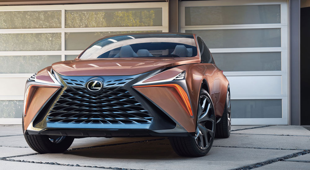
Probably the most controversial elements of modern Lexus products is the so-called ‘Spindle’ grille shape. Hunter says it’s here to stay. “Spindle is our brand identity, it’s our aim to make it attractive of course, and the LF-1 is the next step in its evolution. We call it ‘architectural spindle’.

“You notice as the perimeter shape transitions up, it turns into into a pretty distinctive hood shape that has a channel, that runs all the way though the belt-line, and even the DRL runs the perimeter of the hood shape. Everything is integrated into one architectural piece.”

(The LF-1 Limitless is certainly a departure from when it comes to the “traditional” spindle grille. The integration is embedded deep into the design, to the point where the functional mesh of the grille merges with the spindle surround.)

Concepts
Comments
Gecko
It's far from perfect, but I would have liked the LS front end to look more like the right side of this pic.

Left is stock, right is edited (simplified headlight, straightened the bottom part of the grill, blacked out the right-hand opening and eliminated the extra body line around the grill)


Well check this Gecko... the F-Sport does exactly what you want...so now I'm eating crow lol...

I like how that looks!!!
Ian Schmidt
In some ways, that's where the spindle came from. Pre-spindle Lexus cars had the top 1/3rd of the spindle as the actual grille, and then there were shapes strongly implying the other 2/3rds. The spindle just changed it so the whole shape was the grille.
Yes, that's true, but taking out that large center-section that (formerly) split the two halves of the upper and lower spindle made a big difference in the visual perception. Note the difference, for example, between the 2015 ES and 2018 ES.


The F Sport looks much better indeed. Shame you can't get any of the luxury features on it.
mmcartalk
Yes, that's true, but taking out that large center-section that (formerly) split the two halves of the upper and lower spindle made a big difference in the visual perception. Note the difference, for example, between the 2015 ES and 2018 ES.
Agreed in the big change it makes, but to me now the 2015 looks like a spindle wearing a band-aid :)
Ian Schmidt
The F Sport looks much better indeed. Shame you can't get any of the luxury features on it.
I'm still wondering whether you can't get any luxury features on it. Probably not, but when I went through this lexus chose packages url (sent from lexus) it seemed to let me choose the luxury package with the Fsport ... it may just be a problem with that url because it wasn't a standard build sequence
As much as I love to drive - and drive hard - I can't imagine plunking down $90k on an LS that didn't even have wood grain interior. I think my perfect LS might be the standard car with the interior upgrade package and F-Sport wheels... those I do really love!

I do not care for the front end of the F Sport compared to the standard car, which has that awesome 3D mesh pattern (I know F Sport has a different 3D mesh, but I like the standard one more). Also not a huge fan of how the F Sport doesn't go side-to-side in the grille.

G