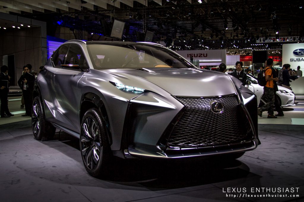
After staring at photos for months, I finally had a chance to see the Lexus LF-NX concept at the Tokyo Motor Show.
Before seeing the LF-NX in person, I had no idea how Lexus was going to transform it into a production model — the concept appeared architectural, more structure than automobile, like a solid block of steel.
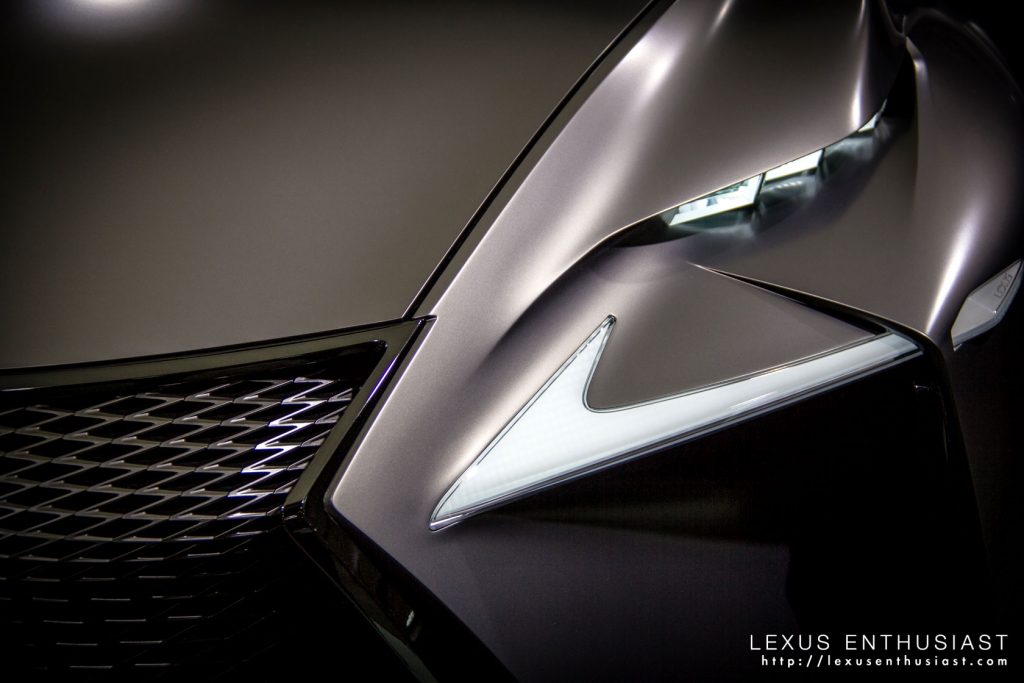
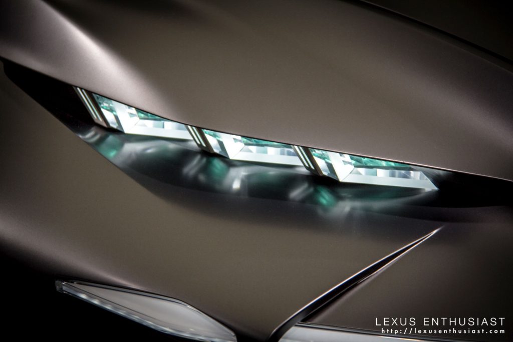
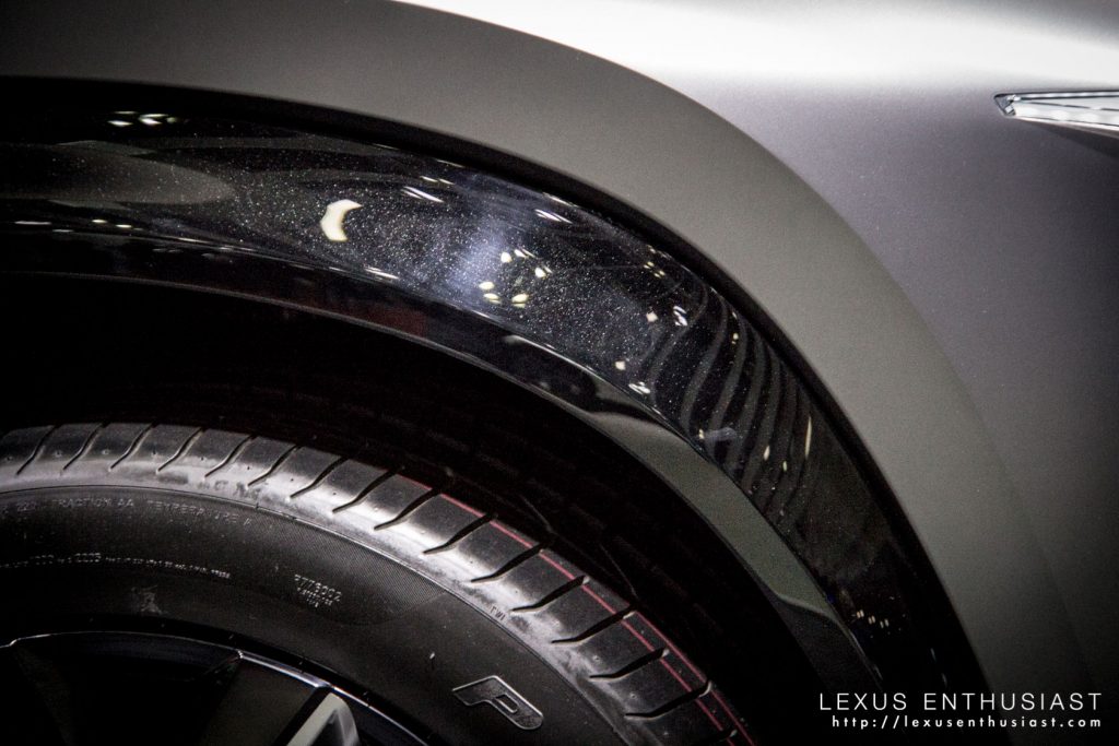
Imagine my surprise when the visual heaviness of the design just near disappeared in real life — the sharpness is still there, but it doesn’t dominate in the same way.
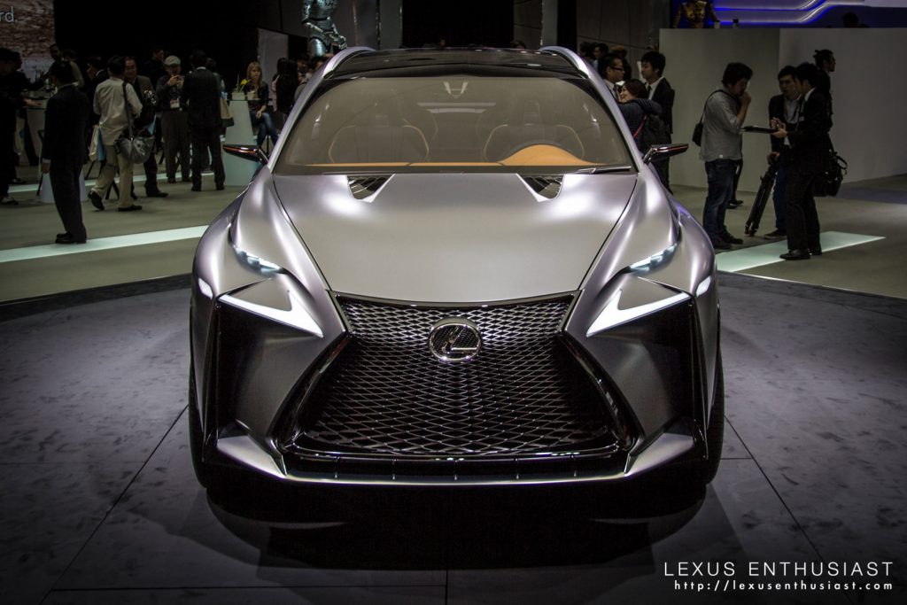
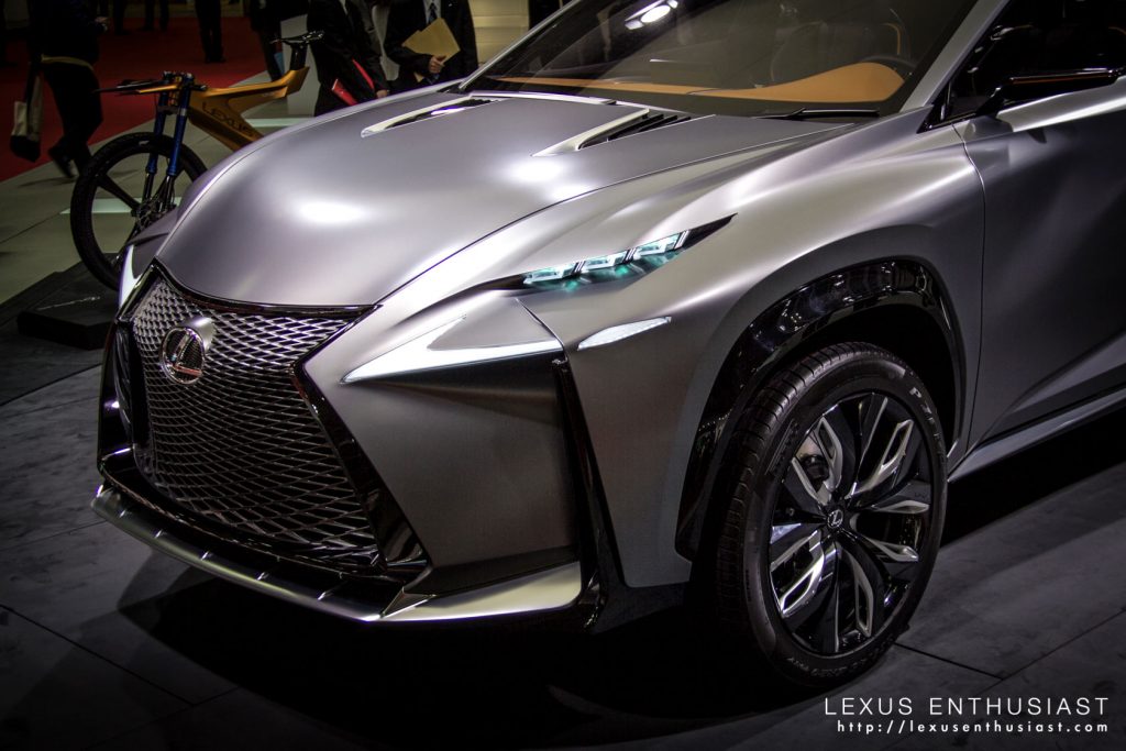
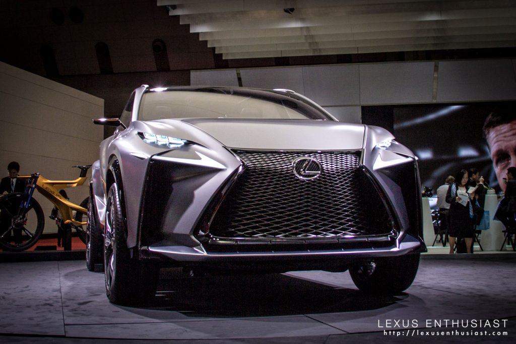
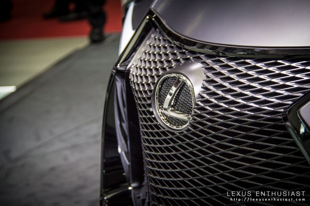
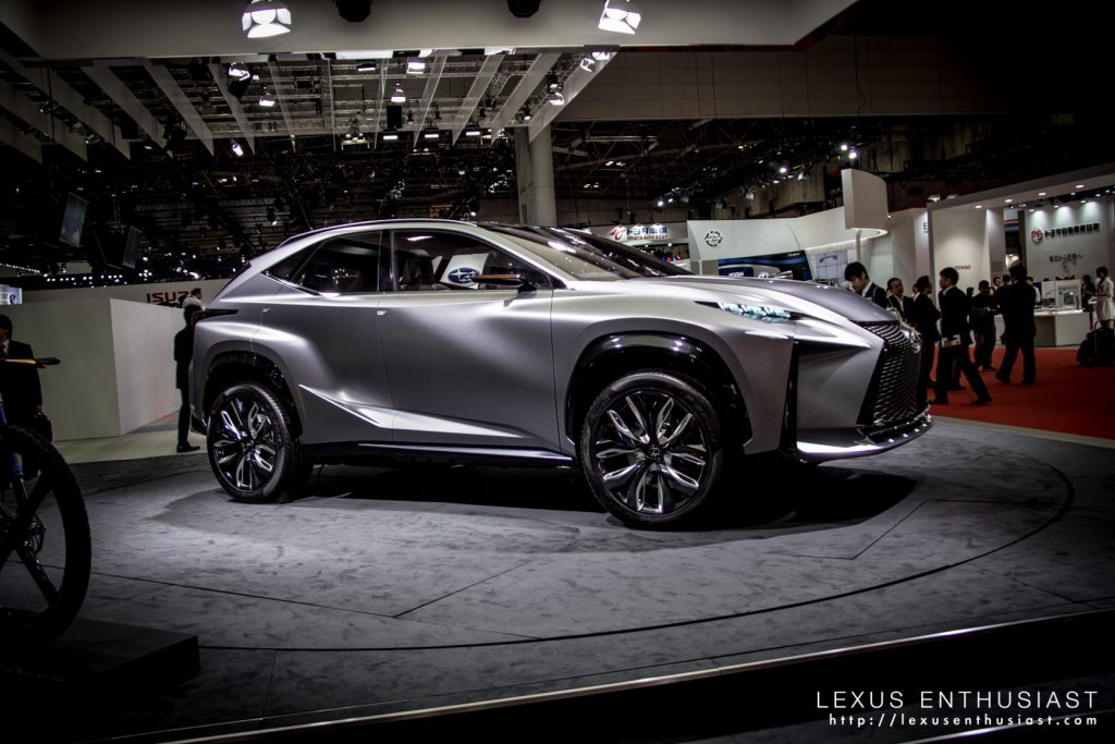
Despite this softening of the edges, the LF-NX front end is still too bold — however, get the proper angle and the design all makes sense:

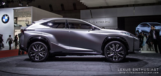
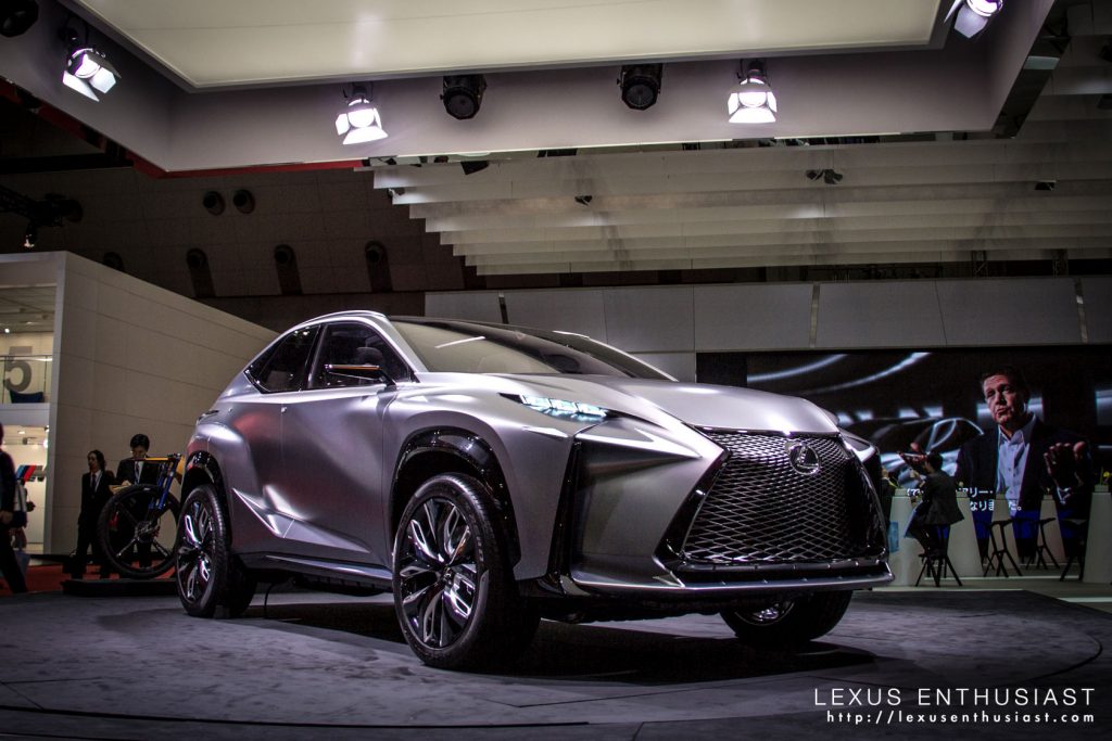
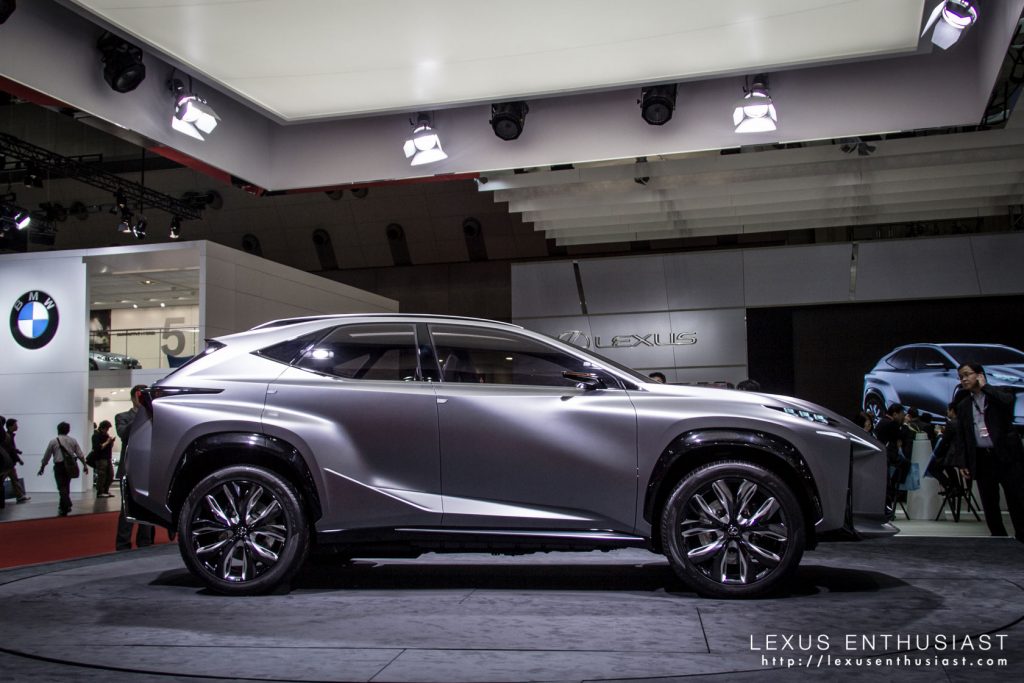
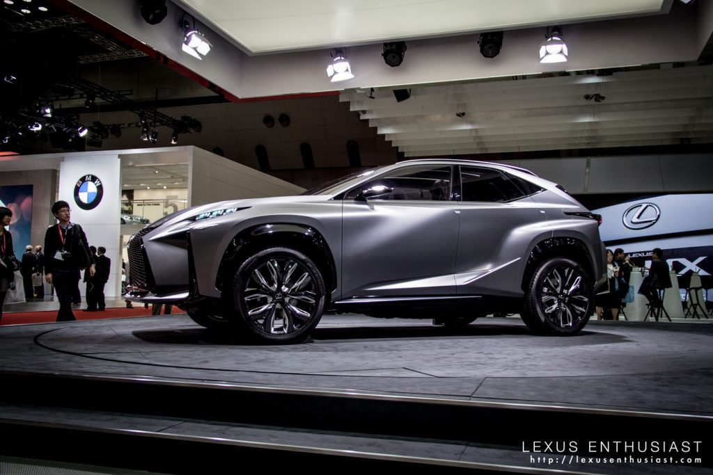
The side profile is the most balanced — the silhouette is distinct, like a cross between the IS & RX, and the body creases give the doors a muscular feel:
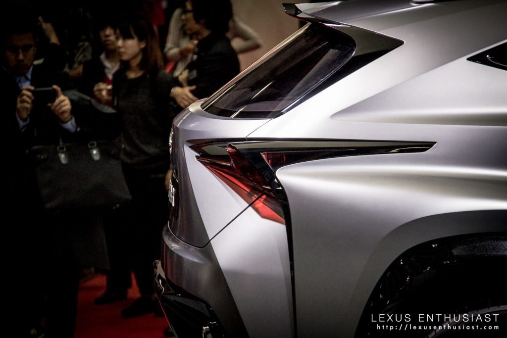
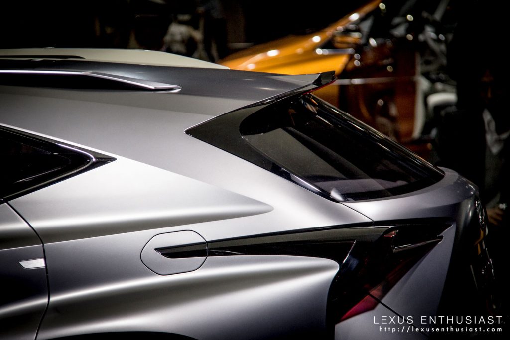
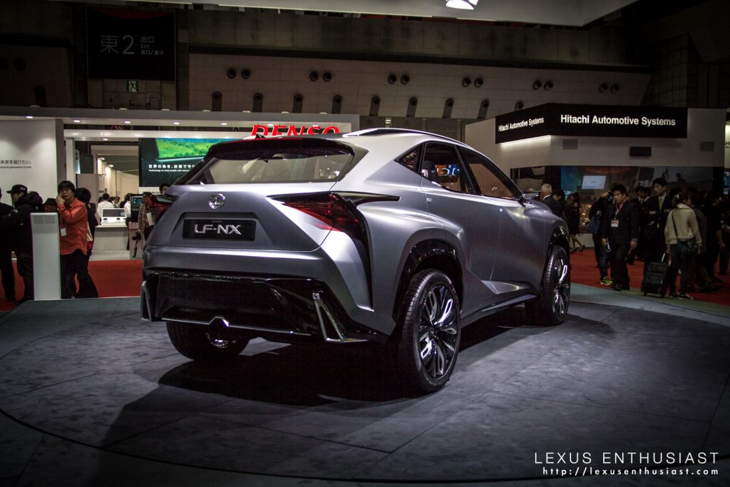
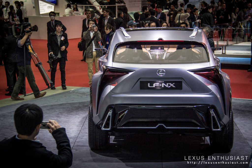
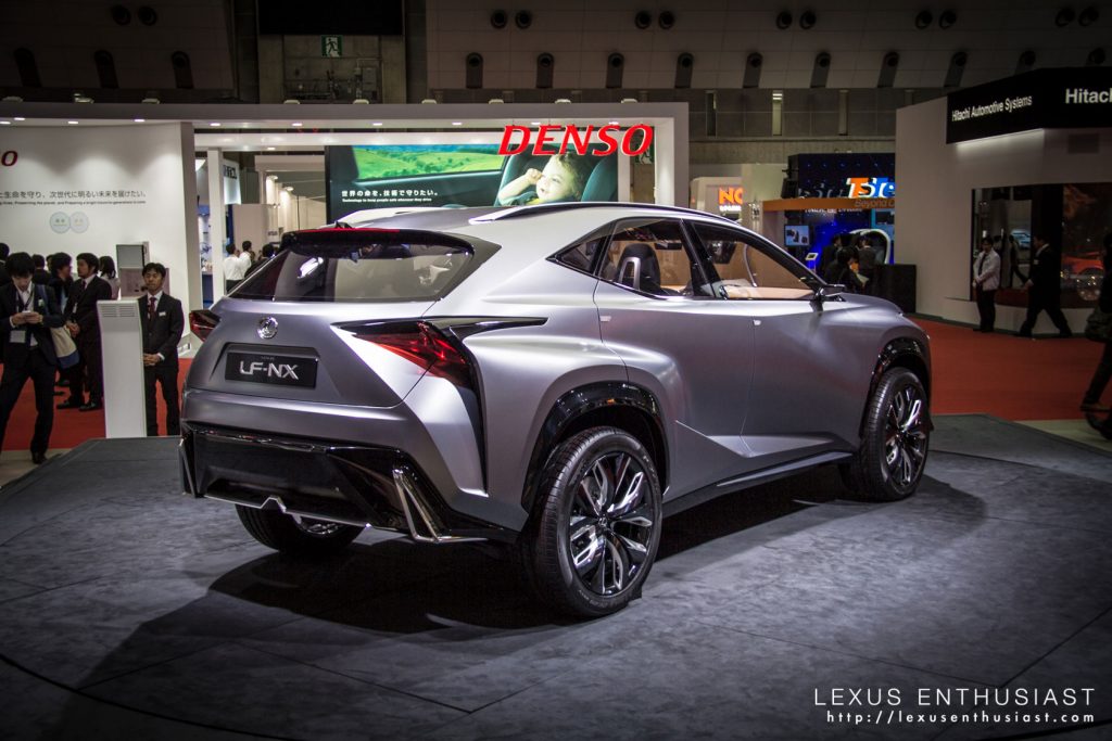
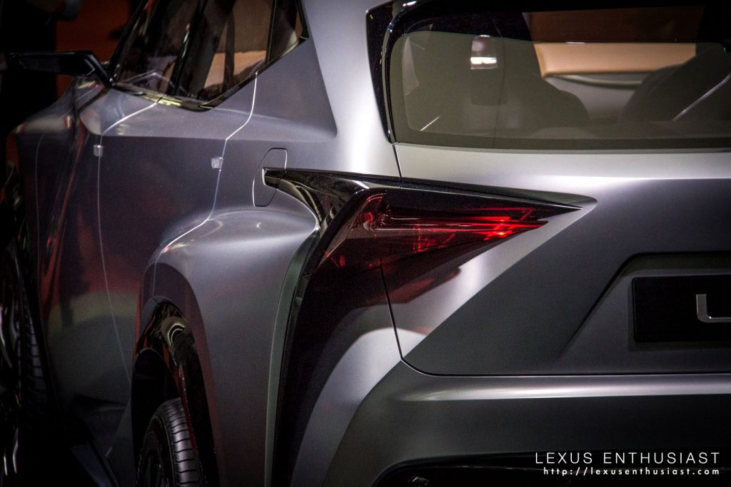
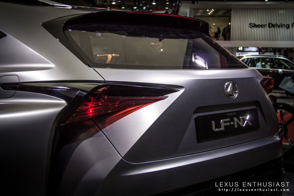
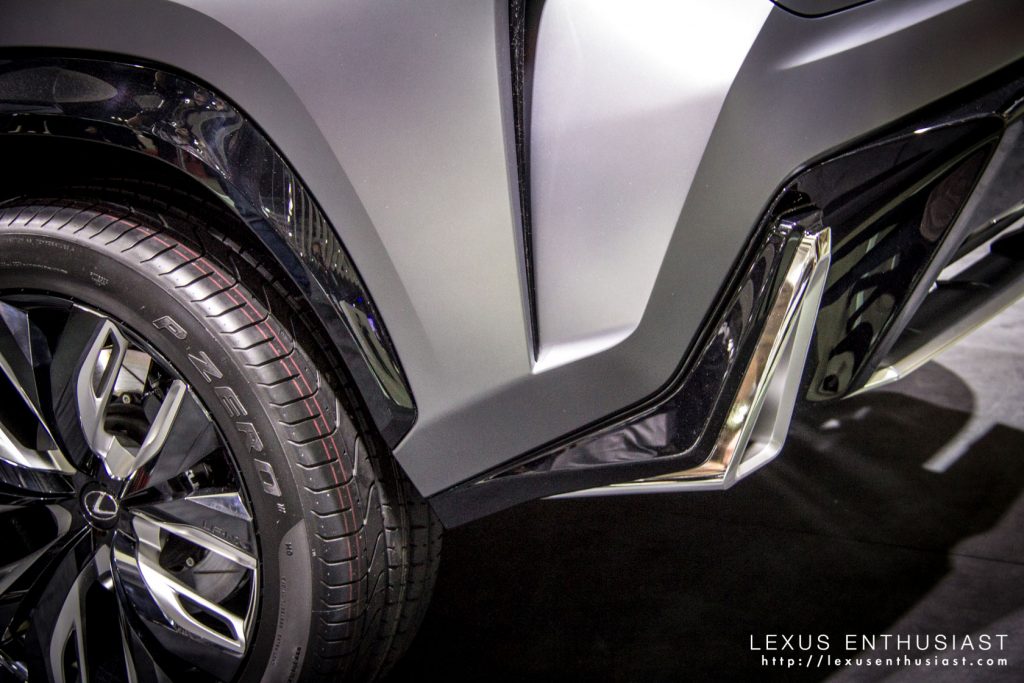
If there’s one element of the LF-NX that doesn’t work for me, it’s the rear design — there’s too many complex folds and edges, especially the large vertical slash under the taillights:
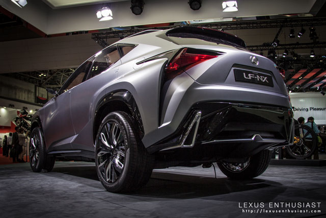
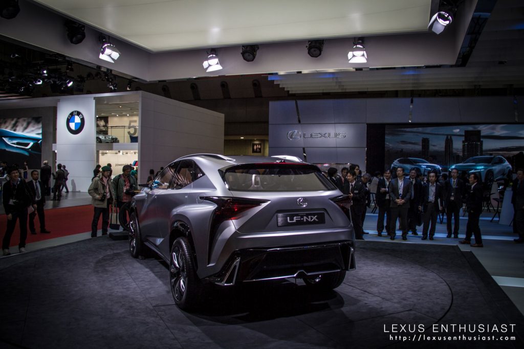
A Lexus executive told me something insightful about the LF-NX, in that the design is ill-suited to being on a platform — looking up at the concept gives it a very boxy look. To continue that thought, I believe all of the angles & shadows make it appear harsh and unforgiving in photos.
In person, you can squint and see a production model — there’s the promise of a crossover that manages to capture something unique, something more dynamic and aggressive than its competitors.
It’s another unusual twist in a series of moves by Lexus, who have taken great pride in disrupting expectations. Who would have ever expected anything like this from Lexus even two years ago?


Comments