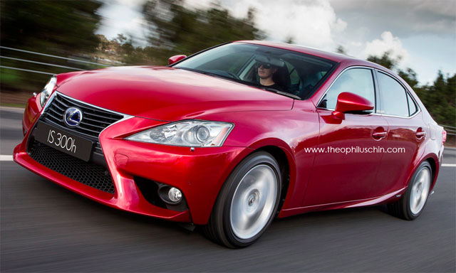
Photochop: New Lexus IS with Old Headlights


As an experiment, photochopper Theophilus Chin decided to swap out the new Lexus IS headlights with the previous generation design — along with the image above, here’s a second example:

Lexus IS Old Headlights

With their separated LED running lights and scalloped edge, the headlights on the 2014 IS are certainly a point of controversy — however, this photochop proves how well the new design is integral to the car’s overall appearance.

Really, this just shows me how much I’ve grown to like the new headlights — what do you think?

View the IS Headlight Swap in High Resolution

Lexus IS: Third GenerationPhotochops
Comments
Y
  • Y
    Yong Thian Ding
  • September 3, 2013
Old headlights on new IS looks like the IS is shocked due to something . XD
    K
    • K
    • September 3, 2013
    Yeah, that's it exactly. Too big!
W
  • W
    Wunko
  • September 3, 2013
I think the photochop would be better if it was the 2011-2013 IS headlights that have the LED DRLs in them. I don't mind split headlights but I just don't like how big the gap is between the LED DRLs and the headlights in the 2014 IS.
F
  • F
    F1orce
  • September 3, 2013
Yeah I agree the new headlights match the rest of the 3IS Having said that, the 2IS in my eyes still looks much cleaner and refined. Especially the facelifted models with the LED running light. Expect the facelift 3IS to tone down and refine the overall design scheme.
F
  • F
    F1orce
  • September 3, 2013
2IS
M
  • M
    Manny
  • September 3, 2013
I agree the 2IS looked much cleaner and gap between the DRL's and the main light is not that great. I love the lights on the GS, they should have use those on the 3IS :>
    F
    • F
      F1orce
    • September 3, 2013
    Yeah exactly the 2IS does indeed have a much more clean & refined design. I think Lexus ran out of ideas, the 2IS is a beautiful & handsome piece of design. So they took the fundamental design element of the 2IS and started carving & chiseling it out to create the 3IS. There are certain aspects where Lexus of could easily enhanced the appearance of the 3IS such as bigger wheels, less wheel diameter between rubber & alloy, less fender to wheel gap and larger headlamps. But then that's what mid-life facelifts are for! Contrary to belief the spindle grille actually is very nicely implemented into the 3IS. . So that obviously is not the issue with the design of the 3IS. Here are some images of the 2IS for reference..
    F
    • F
      F1orce
    • September 3, 2013
    The answer to all the concerns is a simple one. Lexus no longer designs their products with the L-Finesse design language.
    N
    • N
      nj101
    • September 3, 2013
    looks are subjective. I guess you still have not seen the new IS in person. Lexus no longer use L-Finesse design? The new IS is the evolution of L-Finesse design.
    R
    • R
      Roman Pogoretskiy
    • September 3, 2013
    Take a note of the c pillar on the 3is. Does it remind you of the 1is? The whole back end of it looks like the 1st gen.
    N
    • N
      nj101
    • September 3, 2013
    IMO, the first gen IS was one of the best designed car of all time. Still looks great today. Perhaps Lexus avoided the coupe-like silhouette of the 2nd gen IS to improve the back set area. I just wonder where on earth did you got the vision/idea on how the back of the new IS looks, have your eyes checked dude.
    R
    • R
      Roman Pogoretskiy
    • September 3, 2013
    That's your opinion dude. And you said it yourself that they looked to the 1is for more head room on the back and less coupe-like look of the 2is. That's why it looks similar. Which also reminds me of the new Corolla's c-pillar. Try finding a pick of the two 1is and 3is side by side and look at the taillight design, the rear end of how the window ends, and the shape of the roofline. It's definitely using the 1gen's design language there. Trust me, I'm a designer.
B
  • B
    BlackDynamiteOnline
  • September 3, 2013
These are a little too large. They don't fit the lean and mean design of the new IS What's important is the car's design is right..... BD
B
  • B
    blkpantha
  • September 3, 2013
the headlights are awesome honestly they just don't photography well and then people consider them ugly because the photos comes out looking like a gap between the headlights but they actually sit in front of the headlights just like how the Lexus latest concept photographs is. however in over shot shoot it really showcase the headlights
R
  • R
    Roman Pogoretskiy
  • September 3, 2013
What this proves to me is how ugly the whole vehicle actually is. It's like it was built to be ugly; every bit and piece. Maybe it's just me but Lexus' older designs were much more promising than these.
E
  • E
    enthusiast88
  • September 3, 2013
My favorite exterior feature of the 2014 IS is the headlights. In person it just looks taut, stylish, and unique. I am actually surprised (and didn't realize) this is and area of controversary and criticism.
    M
    • M
      Marlene
    • September 3, 2013
    I love the new headlights. They look positively predatory!
J
  • J
    Joe Z Performance
  • September 3, 2013
Would have been better if he at least used the outgoing 2013 headlight... Or the LED Lights from the current 4th Gen GS450h ;) ~ Joe Z
N
  • N
    nj101
  • September 3, 2013
New IS' headlight really should not be a thing of controversy.Once you see it in person, you'll realize how good looking it is. Those saying that old IS's headlight or GS' DRL is better have never seen the new IS in person. No offence to all GS' owners, but if you place the new IS and the GS side by side, the latter looks tamed.
J
  • J
    jezze
  • September 3, 2013
i think if they added the headlights from 2012 it would look better the one with daytime lights
T
  • T
    Travis
  • September 9, 2013
New headlights look better
M
  • M
    Michal K
  • January 9, 2014
I drive IS 300h 2014. When Ive seen the car on pictures I didnt like them at all. Then Ive seen the car in person and I was like "it doesnt look so bad". Now I think the style of lights completelly corespondens with sharp design of the car. The old headlights look weird on the car.

M